Official statement
Other statements from this video 18 ▾
- □ Are images really slowing down your site's SEO performance?
- □ How can you actually boost your website's performance by selecting the right image format?
- □ Should you really automate image compression for SEO purposes?
- □ Is your website really serving the right image size to each device?
- □ Does Google really index all your responsive image variations with picture and srcset?
- □ Should you systematically use lazy-loading for all images below the fold?
- □ Should you really avoid lazy-loading for all your images?
- □ Should you really use the HTML loading attribute to optimize lazy-loading?
- □ Are images really the main bottleneck killing your site's performance?
- □ Are poorly configured images really harming your SEO through layout shifts?
- □ Do you really need picture and srcset to optimize responsive images for SEO?
- □ Should you declare alternative image versions using structured data to boost Google's indexing?
- □ Should you really enable lazy-loading on every single below-the-fold image?
- □ Is lazy-loading all your images actually hurting your SEO performance?
- □ Should you really be using the HTML loading attribute for lazy-loading in 2024?
- 1:22 Do you really need to migrate your images to WebP and AVIF to boost your SEO?
- 1:57 Should you really automate image compression for SEO success?
- 1:57 Should you really manually verify automatic image compression results for your website?
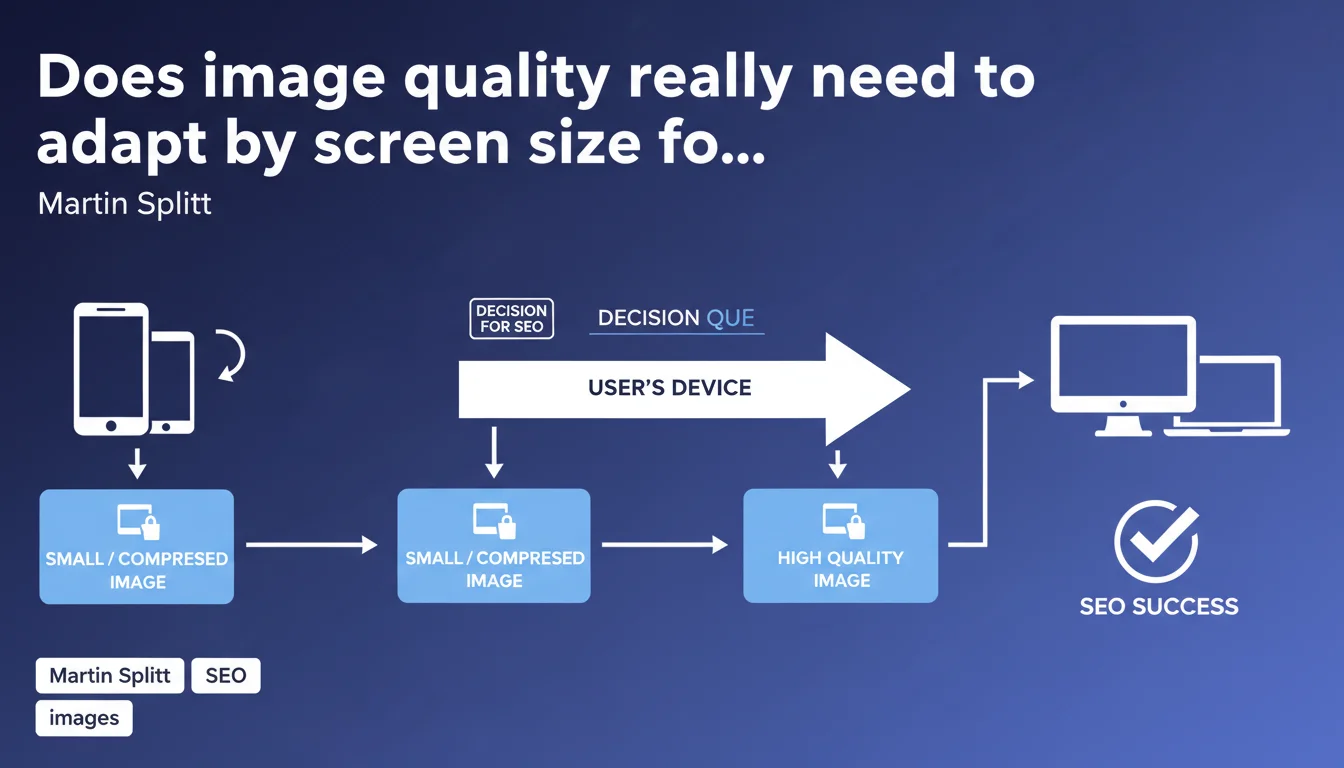
Google recommends serving optimized images differently depending on the device: compressed and lightweight images for mobile, superior quality for desktop. This approach directly impacts Core Web Vitals and user experience, two pillars of ranking. Responsive sizing is no longer optional.
What you need to understand
Why does Google insist on responsive image sizing?
Images often represent more than 50% of a web page's weight. Serving the same high-definition resolution to a smartphone and a 4K screen is a technical aberration. Google knows this, and its algorithm penalizes this inefficiency through Core Web Vitals, particularly LCP (Largest Contentful Paint).
Responsive sizing consists of delivering multiple versions of the same image depending on context: screen resolution, pixel density (retina or not), viewport. This is the principle of srcset and the sizes attribute in HTML, or modern formats like WebP/AVIF with fallback.
What's the difference between compression and resizing?
Common confusion. An image can be small in dimensions (300x200px) but heavy in file size (500KB if poorly compressed). Conversely, a 1920x1080 image well-optimized in WebP can weigh less than 100KB.
Google discusses both aspects here: adapting physical dimensions (fewer pixels for a 375px-wide screen) AND quality/compression (higher compression ratio for mobile). Small screens tolerate more compression without perceptible quality loss.
Does mobile-first indexing change everything?
Yes, radically. Google crawls and indexes the mobile version of your site as a priority. If your mobile images are bloated, it's this bloated version that Googlebot analyzes first. Result: wasted crawl budget, poor LCP, impacted ranking.
Serving lightweight images on mobile isn't just a UX question — it's a direct ranking variable via mobile-first indexing and CWV signals.
- Responsive sizing = dimensions AND compression adapted by device
- Direct impact on LCP, FID, and CLS (Core Web Vitals)
- Mobile-first indexing makes this optimization critical for ranking
- Using srcset, sizes, and modern formats (WebP, AVIF) is no longer optional
- Google penalizes sites that serve identical images on all devices
SEO Expert opinion
Is this recommendation consistent with real-world observations?
Absolutely. PageSpeed Insights and CrUX Data audits show an obvious correlation between unoptimized images and poor CWV scores. Sites implementing srcset + modern formats systematically gain 20 to 40% on mobile LCP.
What often gets stuck: legacy CMSs. WordPress handles srcset natively since 2015, but proprietary platforms or poorly coded themes still serve fixed images. Result: a smartphone receives a 2000px image when it displays 400px. Pure waste.
What nuances should be added to this statement?
Google doesn't specify acceptable compression thresholds. At what rate does an image become too degraded? [To verify] — no official data. Real-world experience suggests a WebP compression rate of 75-80 for mobile and 85-90 for desktop is a good balance.
Another gray area: images "above the fold" versus "below the fold". Should you lazy-load all images or prioritize immediate hero loading? Google recommends lazy loading by default, but a poorly managed hero can explode LCP. Responsive sizing doesn't eliminate the need for a thoughtful loading strategy.
Also beware of CDN and automatic transformations. Cloudflare, Imgix, or Akamai offer automatic responsive sizing. Convenient, but if misconfigured, it can generate random quality variations that Google detects as inconsistencies.
In what cases does this rule not fully apply?
Sites with very high desktop traffic (B2B, complex SaaS tools) can prioritize desktop quality without compromising mobile. But mobile remains the indexing reference, so it's impossible to completely ignore this directive.
E-commerce sites face a dilemma: product images in high resolution for zoom versus performance. The solution: serve lightweight thumbnails in a grid, then load high resolution only on click. Again, responsive sizing is key — but it doesn't solve the HD zoom problem on its own.
Practical impact and recommendations
What should you do concretely to implement responsive sizing?
First lever: use srcset and sizes in HTML. Srcset defines multiple versions of the image (e.g., image-300.jpg, image-600.jpg, image-1200.jpg), sizes tells the browser which size to display based on viewport. The browser automatically chooses the optimal version.
Second lever: adopt modern formats. WebP reduces file weight by 25-35% versus JPEG at equivalent quality. AVIF goes even further (40-50%), but requires fallback. The <picture> tag allows proper fallback management.
Third lever: automate via an image CDN or CMS plugin. Cloudflare Image Resizing, Imgix, or ShortPixel (WordPress) generate variants automatically. Huge time savings, but verifying output quality remains essential.
What errors should you absolutely avoid?
Never resize an image using CSS/HTML only. A width="300" on a 2000px image changes nothing in downloaded weight — the browser loads the 2000px then displays it at 300px. Total aberration.
Also avoid systematic lazy loading of the hero. If your main image is lazy-loaded, LCP skyrockets. Google recommends loading above-the-fold images immediately, lazy-load the rest.
Watch out for overly aggressive Cache-Control directives. If your images change regularly (e-commerce, news), a 1-year cache can block updates. Find the right balance between performance and freshness.
How do you verify your site is compliant?
PageSpeed Insights remains the reference tool. It detects oversized images and proposes optimized versions. If PSI returns "Properly size images" or "Serve images in next-gen formats", you have work to do.
Also use Chrome DevTools > Network to compare actual downloaded weight on mobile versus desktop. If it's identical, your responsive sizing isn't working. Test with a mobile viewport (375px) and desktop (1920px) — file sizes should differ.
- Implement srcset and sizes on all non-decorative images
- Convert JPEG/PNG to WebP with fallback (or AVIF if resources available)
- Never lazy-load above-the-fold images (hero, banner)
- Automate via CDN or plugin to save time (Cloudflare, Imgix, ShortPixel)
- Audit with PageSpeed Insights and check image recommendations
- Compare downloaded weight mobile/desktop in Chrome DevTools
- Define compression thresholds: 75-80 (mobile), 85-90 (desktop) for WebP
❓ Frequently Asked Questions
Le responsive sizing des images améliore-t-il vraiment le ranking Google ?
Faut-il privilégier WebP ou AVIF pour le responsive sizing ?
Srcset et sizes suffisent-ils ou faut-il aussi un CDN image ?
Les images SVG échappent-elles à cette recommandation ?
Google pénalise-t-il réellement les sites sans responsive sizing ?
🎥 From the same video 18
Other SEO insights extracted from this same Google Search Central video · published on 02/07/2024
🎥 Watch the full video on YouTube →
💬 Comments (0)
Be the first to comment.