Official statement
Other statements from this video 18 ▾
- □ Les images freinent-elles vraiment les performances SEO de votre site ?
- □ Quel format d'image choisir pour booster réellement les performances de votre site ?
- □ Faut-il vraiment automatiser la compression de vos images pour le SEO ?
- □ Picture et srcset pour le responsive : Google indexe-t-il vraiment toutes vos images ?
- □ Faut-il systématiquement utiliser le lazy-loading pour toutes les images en dessous de la ligne de flottaison ?
- □ Faut-il vraiment éviter le lazy-loading sur toutes vos images ?
- □ Faut-il vraiment utiliser l'attribut HTML loading pour optimiser le lazy-loading ?
- □ Les images sont-elles vraiment le principal frein à la performance de votre site ?
- □ Les images mal configurées nuisent-elles vraiment au référencement via les layout shifts ?
- □ Faut-il vraiment adapter la qualité d'image selon la taille d'écran pour le SEO ?
- □ Faut-il vraiment utiliser picture et srcset pour optimiser les images en responsive ?
- □ Comment exploiter les données structurées pour déclarer les versions alternatives d'images ?
- □ Faut-il vraiment activer le lazy-loading sur toutes les images below-the-fold ?
- □ Faut-il vraiment arrêter de lazy-loader toutes vos images ?
- □ Faut-il vraiment utiliser l'attribut HTML loading pour le lazy-loading ?
- 1:22 Faut-il vraiment migrer ses images vers WebP et AVIF pour améliorer son SEO ?
- 1:57 Faut-il vraiment automatiser la compression d'images pour le SEO ?
- 1:57 Faut-il vraiment vérifier manuellement la compression automatique de vos images ?
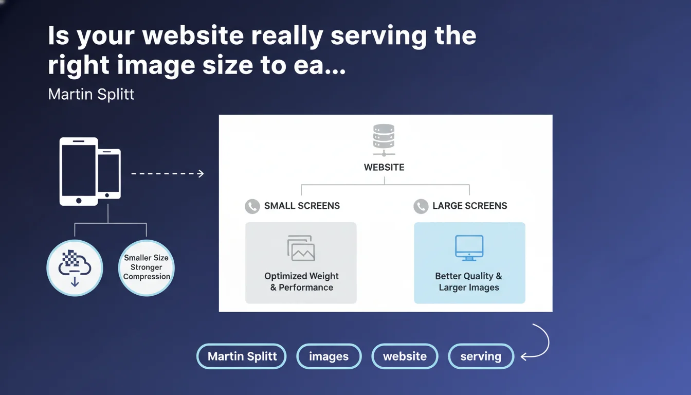
Google recommends serving lighter and more compressed images to mobile users, while reserving high-resolution versions for larger screens. This approach aims to optimize page performance and weight according to the display context. In short: responsive design applies to visual assets too, not just layouts.
What you need to understand
Why does Google insist on adaptive image sizing?
Web performance remains an official ranking criterion, particularly through Core Web Vitals. A mobile user on an average 4G connection shouldn't have to download a 4K image designed for a 27-inch screen. That's a waste of bandwidth, and it degrades Largest Contentful Paint (LCP) and overall loading time.
This statement reminds us that image weight plays a major role in user experience — and Google values sites that adapt their resources to real browsing context. It's consistent with the "mobile-first" philosophy: mobile isn't a by-product, it deserves optimized treatment.
What distinguishes a "responsive" image from a static one?
A static image is a single file served to all users, regardless of screen size. A responsive image leverages HTML mechanisms (the srcset and sizes attributes) or server-side technologies to deliver multiple versions of the same visual. The browser then selects the most appropriate one based on screen resolution and pixel density.
Compression can also vary: 80% quality JPEG on mobile, 90% on desktop. The end user sees no significant visual difference, but the file size savings are real.
Is this approach compatible with all CMS platforms?
In theory, yes. WordPress has been automatically generating multiple image sizes for years. Shopify, Wix, PrestaShop — most modern CMS platforms offer responsive imaging by default. But you need to verify that your themes and plugins actually leverage these features.
If your site is custom-built or you manage assets manually, it's up to you to implement srcset and configure your image servers (or CDN) to generate the necessary variants. It's not automatic.
- Image weight directly impacts Core Web Vitals, especially LCP
- Responsive sizing relies on
srcset,sizes, and potentially server-side solutions (CDN, image optimization services) - Compression can be adjusted per device without perceptible loss of visual quality
- Most modern CMS platforms support this logic, but you need to verify the actual implementation on your site
SEO Expert opinion
Is this statement truly new or just a reminder?
Let's be honest: Martin Splitt isn't breaking new ground here. Responsive imaging has existed since the introduction of srcset in 2014. What Google is doing is reaffirming that this front-end best practice has measurable SEO impact through performance.
What's interesting is the timing. With the emphasis on Core Web Vitals, Google is reminding everyone that visual optimization isn't optional. But be careful — this statement remains vague about the precise thresholds for weight or format that would put a site in the red. [To verify]: What is Google's exact tolerance for "too heavy" images? No specific metrics here.
Are there cases where serving the same image everywhere is still acceptable?
Yes. If your site is ultra-lightweight, your images are already optimized and compressed (WebP or AVIF format, aggressive compression), and your LCP is under 2.5 seconds on mobile, you're not a priority for optimization. The ROI of complex srcset implementation may be marginal.
On the other hand, as soon as you have large visuals (high-resolution product photos, creative portfolios, media-heavy editorial content), failing to adapt image size based on device is a costly mistake. You penalize your mobile users — and Google detects this through CrUX data.
What technical pitfalls should you avoid with responsive sizing?
The classic trap: declaring a srcset but serving all variants from a slow server without a CDN. Result: you multiply HTTP requests without real speed gains. Another pitfall: poorly configured sizes that force the browser to download a larger image than necessary.
And then there's lazy-loaded images: if you delay loading your LCP because you're waiting for intersection observer, you degrade your Core Web Vitals. Never lazy-load the main image above the fold.
Practical impact and recommendations
What should you actually do to adapt your image sizes?
First step: audit your current images. Use Lighthouse, PageSpeed Insights, or WebPageTest to identify assets dragging down your LCP. Find heavy visuals being served without variation across devices.
Next, generate multiple versions of each image (minimum: mobile @1x, mobile @2x, tablet, desktop). If you're on WordPress, activate an image optimization plugin that handles srcset automatically. If you have a custom build, implement <img srcset="..." sizes="..."> in your templates.
Finally, enable a CDN with image optimization (Cloudflare, Cloudinary, Imgix). These services generate and serve the right variants on the fly, with no manual intervention.
What mistakes should you avoid during implementation?
Don't fall into the over-optimization trap. Generating 15 variants per image doesn't help if your site only has 3 real CSS breakpoints. Stay pragmatic: mobile, tablet, desktop are enough in 90% of cases.
Another common mistake: forgetting to compress images before uploading. Perfect srcset won't save a 3 MB PNG at the source. Compress first (TinyPNG, Squoosh, ImageOptim), then generate variants.
And be wary of exotic formats with poor support. WebP is now safe, AVIF is getting there, but if you don't provide a JPEG fallback, you're excluding users on older browsers.
- Audit heavy images using Lighthouse or PageSpeed Insights
- Generate at least 3 versions per image: mobile, tablet, desktop
- Implement
srcsetandsizesin your HTML templates - Enable a CDN with automatic image optimization
- Compress images at the source before uploading
- Provide a JPEG fallback for modern formats (WebP, AVIF)
- Never lazy-load the main image above the fold
How do you verify your implementation is working correctly?
Open Chrome DevTools in mobile mode, go to the Network tab, and filter by "Img". Reload the page and check which variant of each image is downloaded. If you see 2 MB files on mobile, your srcset isn't working.
Also test with different real devices or BrowserStack. Sometimes Chrome emulation doesn't exactly reflect the behavior of an iPhone 12 on Safari. Google's CrUX data are invaluable here — they show you actual performance as perceived by your real users.
❓ Frequently Asked Questions
Le srcset est-il obligatoire pour bien se positionner sur Google ?
Faut-il utiliser WebP ou AVIF pour les images responsive ?
Comment savoir si mon CMS génère déjà des images responsive ?
Les images responsive ralentissent-elles le serveur ?
Que faire si mon site a des milliers d'images déjà en ligne ?
🎥 From the same video 18
Other SEO insights extracted from this same Google Search Central video · published on 02/07/2024
🎥 Watch the full video on YouTube →
💬 Comments (0)
Be the first to comment.