Official statement
Other statements from this video 18 ▾
- □ Les images freinent-elles vraiment les performances SEO de votre site ?
- □ Quel format d'image choisir pour booster réellement les performances de votre site ?
- □ Faut-il vraiment automatiser la compression de vos images pour le SEO ?
- □ Faut-il vraiment adapter la taille de vos images selon l'appareil de l'utilisateur ?
- □ Picture et srcset pour le responsive : Google indexe-t-il vraiment toutes vos images ?
- □ Faut-il systématiquement utiliser le lazy-loading pour toutes les images en dessous de la ligne de flottaison ?
- □ Faut-il vraiment éviter le lazy-loading sur toutes vos images ?
- □ Faut-il vraiment utiliser l'attribut HTML loading pour optimiser le lazy-loading ?
- □ Les images sont-elles vraiment le principal frein à la performance de votre site ?
- □ Faut-il vraiment adapter la qualité d'image selon la taille d'écran pour le SEO ?
- □ Faut-il vraiment utiliser picture et srcset pour optimiser les images en responsive ?
- □ Comment exploiter les données structurées pour déclarer les versions alternatives d'images ?
- □ Faut-il vraiment activer le lazy-loading sur toutes les images below-the-fold ?
- □ Faut-il vraiment arrêter de lazy-loader toutes vos images ?
- □ Faut-il vraiment utiliser l'attribut HTML loading pour le lazy-loading ?
- 1:22 Faut-il vraiment migrer ses images vers WebP et AVIF pour améliorer son SEO ?
- 1:57 Faut-il vraiment automatiser la compression d'images pour le SEO ?
- 1:57 Faut-il vraiment vérifier manuellement la compression automatique de vos images ?
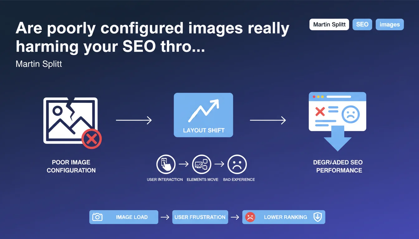
Google confirms that poorly implemented images cause layout shifts that degrade user experience. These layout shifts directly impact your CLS score, a major component of Core Web Vitals, and therefore potentially your rankings. The key: systematically specify image dimensions to prevent the browser from reorganizing the page during loading.
What you need to understand
Why do images cause layout shifts?
When a browser loads an HTML page, it starts displaying content before all resources (CSS, images, scripts) are downloaded. If an image's dimensions are not explicitly declared in the code, the browser initially reserves zero pixels for it.
When the image loads, the browser discovers its actual size and must reorganize all following elements to make room for it. This sudden shift — text jumping 300 pixels down, a button moving — constitutes a layout shift. Multiplied across multiple images, the effect becomes disastrous for users who click in the wrong place or lose their reading flow.
What's the connection to Core Web Vitals?
The Cumulative Layout Shift (CLS) precisely measures these unexpected visual shifts throughout the entire page lifespan. It's one of three Core Web Vitals metrics that Google uses as a confirmed ranking signal since the Page Experience Update.
A high CLS signals degraded user experience. Images without explicit dimensions represent the number one cause of problematic CLS on the majority of websites analyzed via Lighthouse or PageSpeed Insights. Fixing this point mechanically improves your CLS score — and potentially your rankings.
What are the most common implementation errors?
<img>tags withoutwidthandheightattributes: the browser cannot calculate the aspect ratio before the image loads- Images as CSS backgrounds on containers without defined height: same problem, the container collapses then expands abruptly
- Responsive images without
aspect-ratioCSS: modern solutions (aspect-ratio) are not yet systematically deployed - Poorly configured lazy loading: lazy-loaded images without reserved placeholders aggravate shifts during scrolling
- Dynamic ads and iframes: third-party content areas that insert themselves without prior space reservation
SEO Expert opinion
Does this statement change anything about already-known practices?
No — and that's precisely what's striking. The need to specify image dimensions to avoid layout shifts has been documented since the Core Web Vitals launch and even before, in web performance best practices. Martin Splitt is simply here reminding us of a technical fact.
What stands out is the lack of nuance in the statement. The declaration remains deliberately generic without addressing edge cases: responsive images with srcset, dynamic content, modern CSS grids. Let's be honest — this statement reads more like a public awareness message than a technical revelation.
Don't fixed dimensions pose problems for responsive design?
This is where the statement lacks precision. Specifying width and height in HTML does not mean freezing actual displayed dimensions — but rather defining the aspect ratio that modern browsers use to calculate necessary space.
With width="800" height="600" + img { max-width: 100%; height: auto; } in CSS, the image adapts perfectly to its container while maintaining a 4:3 ratio. The browser can thus reserve the correct space before loading. This mechanism has worked since 2019 in all evergreen browsers — but remains misunderstood or overlooked by many developers.
[To verify] Google has never published specific data on the exact correlation between CLS improvement and ranking gains. Case studies show positive effects, but the magnitude varies greatly depending on industry and competition.
In what cases does this rule become complex to apply?
Several real-world situations make optimization less straightforward than it appears. CMSs and page builders that auto-generate HTML frequently omit dimensional attributes, requiring template modifications or plugins.
Images uploaded by non-technical contributors pose an organizational challenge: how do you ensure each editor correctly enters dimensions, or that the system calculates them automatically? Third-party content (widgets, programmatic ads, social embeds) completely escapes webmaster control — and frequently causes layout shifts impossible to eliminate without sacrificing functionality.
Practical impact and recommendations
How do you concretely fix images causing layout shifts?
The most direct solution: systematically add width and height attributes to each <img> tag. These values must match the image file's intrinsic dimensions, even if CSS later resizes the display.
For responsive images with srcset, use the dimensions of the default source image (the one in src). The browser will calculate the ratio and apply it to all variants. If you use CSS Grid or Flexbox with images, supplement with aspect-ratio in CSS to guarantee stability.
Modern platforms like Next.js (Image component), Nuxt, or image CDNs (Cloudinary, Imgix) automatically manage these attributes — but only if you use their APIs. Plain HTML or traditional WYSIWYG editors require manual vigilance or post-processing scripts.
Which tools can you use to identify problematic images?
PageSpeed Insights and Lighthouse explicitly flag image elements without dimensions in the "Avoid large layout shifts" section. Chrome DevTools displays layout shifts in real-time via the Performance panel and the "Layout Instability" tab.
For large-scale analysis, Screaming Frog SEO Spider (paid version) extracts <img> tags and identifies those missing width/height. WebPageTest offers a filmstrip visualization of shifts during loading — particularly useful for understanding the exact timing of problems.
Search Console does not directly report image-by-image layout shift issues, but the Core Web Vitals report indicates pages with insufficient CLS. Cross-reference this data with Lighthouse to target priority fixes.
What do you do about dynamic and third-party content?
Display ads and social widgets remain the blind spots of CLS optimization. Google recommends reserving minimum space via CSS (min-height) for ad placements, even if the actual ad differs slightly in size.
For Twitter, YouTube, and Instagram embeds: use wrappers with calculated aspect-ratio (the padding-bottom technique at 56.25% for 16:9). Lazy-load solutions must imperatively include a placeholder of the correct dimension — not just a spinner centered on a white background.
User-generated content (forums, comments with images) requires server-side processing: a script that analyzes uploaded files, extracts their dimensions, and automatically injects attributes into generated HTML. Without this automation, maintaining quality at scale is impossible.
- Audit all
<img>tags across your site using Screaming Frog or a custom crawler - Add
widthandheightto every image, even responsive ones - Verify that CSS doesn't override ratios (
max-width: 100%; height: auto;mandatory) - Implement
aspect-ratioCSS for background image containers - Reserve space for third-party ads and embeds via
min-height - Configure lazy-load with correctly sized placeholders
- Automate dimension injection for dynamically generated content
- Test pages with PageSpeed Insights and Chrome DevTools Performance
❓ Frequently Asked Questions
Faut-il aussi spécifier les dimensions pour les images en lazy-load ?
Les attributs width et height empêchent-ils le responsive design ?
Comment gérer les images dont les dimensions varient selon le device ?
Les layout shifts d'images impactent-ils directement le classement Google ?
Peut-on corriger automatiquement les images déjà publiées sur WordPress ?
🎥 From the same video 18
Other SEO insights extracted from this same Google Search Central video · published on 02/07/2024
🎥 Watch the full video on YouTube →
💬 Comments (0)
Be the first to comment.