Official statement
Other statements from this video 15 ▾
- □ Pourquoi Google limite-t-il les sitemaps à 50 000 URLs, index compris ?
- □ Les attributs ARIA améliorent-ils vraiment le SEO de votre site ?
- □ Faut-il vraiment rediriger les URL canonicalisées pour améliorer son référencement ?
- □ Google ignore-t-il vraiment les fragments d'URL (#) pour le référencement ?
- □ Pourquoi l'optimisation technique seule ne fait-elle plus ranker un site ?
- □ Comment vérifier si votre site est sous pénalité manuelle dans Search Console ?
- □ Pourquoi le balisage Product ne sert à rien pour l'immobilier ?
- □ Hreflang fonctionne-t-il vraiment pour du contenu non traduit mais ciblant des pays différents ?
- □ La balise HTML <article> améliore-t-elle vraiment le référencement ?
- □ Liens relatifs vs absolus : y a-t-il vraiment un impact SEO ?
- □ Faut-il vraiment imposer l'anglais dans les données structurées pour les jours de la semaine ?
- □ Comment vérifier qu'un crawler est réellement Googlebot et bloquer les imposteurs ?
- □ Faut-il vraiment utiliser prefetch et prerender pour améliorer son SEO ?
- □ Faut-il vraiment oublier le cache Google pour diagnostiquer l'indexation ?
- □ Pourquoi Google indexe-t-il du contenu qui n'existe pas sur votre site ?
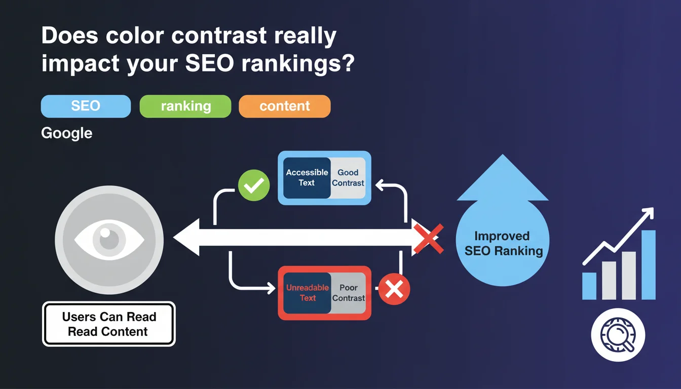
Google confirms that using white text on a colored background poses no SEO problem, as long as the contrast is sufficient for readability. The real criterion isn't aesthetic but functional: your users must be able to read the content effortlessly.
What you need to understand
Why is Google suddenly talking about color contrast?
This statement addresses a recurring concern among some webmasters: the idea that bold design choices (white text on colored backgrounds) could penalize their SEO. Spoiler: it's false. Google doesn't care about your aesthetic choices as long as the content remains readable.
The context here is accessibility. Google wants to ensure that users — all users, including those with visual impairments — can consume the content. Poor contrast harms user experience, and user experience indirectly influences SEO through behavioral signals.
What is "good contrast" according to Google?
Google doesn't provide a precise figure in this statement, but we know that WCAG 2.1 standards (Web Content Accessibility Guidelines) recommend a contrast ratio of at least 4.5:1 for normal text and 3:1 for large text. These standards have become the de facto reference for web accessibility.
Concretely? Light gray text on white background = problem. White text on navy blue background = usually fine. The free WebAIM Contrast Checker tool lets you verify in seconds whether your color combination passes the test.
Does this statement concern only design or also technical SEO?
Both, but indirectly. Google won't demote you because your purple is too pastel. However, if your visitors bounce in droves because they can't read your CTAs or titles, your bounce rate and session duration will plummet.
These behavioral signals — even though Google officially denies using them directly — are correlated with lower rankings. So yes, poor contrast can indirectly hurt your SEO through degraded UX.
- Color contrast is not a direct ranking factor, but impacts user experience
- WCAG 2.1 standards (4.5:1 minimum ratio) are the reference for accessibility
- Poor contrast can degrade behavioral signals (bounce rate, session duration)
- Google prioritizes readability for all users, not pure aesthetics
SEO Expert opinion
Is this statement consistent with what we observe in the field?
Absolutely. No correlation has ever been established between color palette choices and positions in the SERPs. Sites with "aggressive" designs (white text on black, strong contrasts) rank very well if content and technical SEO follow. Conversely, sites with "safe" designs but poor readability struggle.
What matters is that the crawler can extract the text (which never poses a problem with standard HTML text) and that the user can consume it. If your white font on neon yellow background makes reading painful, your engagement metrics will reflect it — and that's measurable.
In what cases could this rule cause problems?
The classic pitfall: text overlaid on images. You have a beautiful hero image with white text on top… except on mobile, the image gets reframed and your text ends up on a light area. Result: unreadable.
Another tricky case: automatic dark/light mode switching. If your site switches to dark mode but your contrast ratios aren't recalculated, you can end up with dark gray text on black background. Catastrophe. [Must verify] systematically across all breakpoints and display modes.
Does Google provide enough information to act effectively?
No. This statement remains vague about "good contrast." No specific threshold, no reference to WCAG, no recommended tool. Pure Google: a general principle without instructions.
For a practitioner, this means finding the information elsewhere — Lighthouse audits, manual testing, WCAG standards compliance. Google tells you to "do it well," but doesn't tell you how to measure that "well." Frustrating, but typical.
Practical impact and recommendations
What should you do concretely to ensure good contrast?
First reflex: audit your site with Lighthouse (built into Chrome DevTools). The Accessibility tab flags elements with insufficient contrast. It's automated, fast, and reliable for 80% of cases.
Second step: manually test your color combinations with WebAIM Contrast Checker or Coolors Contrast Checker. Enter your text and background hex codes, instantly get the ratio and WCAG AA/AAA validation.
Third precaution: test on real devices, not just responsive desktop. Smartphone screens under strong lighting reveal contrast problems invisible in office conditions. A test in bright sunlight = brutal reality check.
What mistakes must you absolutely avoid?
Mistake #1: relying solely on your eye. Your perception isn't everyone's. A colorblind person, someone with low vision, or an elderly user won't see like you do. WCAG ratios exist precisely to objectify what remains subjective.
Mistake #2: neglecting interactive states (hover, focus, active). Your button at rest has good contrast, but on hover it becomes light gray on white? You've just lost accessibility on the most critical action. Every state must pass the test.
Mistake #3: overlaying text on images without semi-transparent overlay or guaranteed solid color zones. If the image changes (A/B test, dynamic content), your contrast breaks. Secure it with a gradient or CSS filter.
How can you verify that your site respects these best practices?
- Run a complete Lighthouse audit and fix all contrast warnings flagged
- Manually verify the main combinations (titles, CTAs, links) with a contrast ratio tool
- Test the site in real conditions: smartphone outdoors, low brightness screen, dark mode enabled
- Validate that all interactive states (hover, focus, disabled) maintain WCAG AA minimum contrast
- Document your color choices in a design system with validated ratios to prevent regressions
❓ Frequently Asked Questions
Un texte blanc sur fond coloré pénalise-t-il le SEO ?
Comment savoir si mon contraste de couleurs est suffisant ?
Les images de fond posent-elles problème pour le contraste ?
Le mode sombre impacte-t-il les exigences de contraste ?
Google utilise-t-il le contraste comme signal de ranking ?
🎥 From the same video 15
Other SEO insights extracted from this same Google Search Central video · published on 09/08/2023
🎥 Watch the full video on YouTube →
💬 Comments (0)
Be the first to comment.