Official statement
Other statements from this video 14 ▾
- □ Un code 403 sur mobile bloque-t-il réellement toute indexation de votre site ?
- □ Les erreurs 404 et redirections 301 nuisent-elles vraiment au référencement ?
- □ La balise canonical bloque-t-elle vraiment l'indexation de vos pages ?
- □ Pourquoi Google voit-il majoritairement vos prix en dollars américains ?
- □ Hreflang et canonical : pourquoi Google les traite-t-il comme deux concepts distincts ?
- □ L'outil de désaveu supprime-t-il vraiment les backlinks toxiques de Google ?
- □ Comment différencier des pages produits identiques sans tomber dans le duplicate content ?
- □ Faut-il vraiment vérifier séparément chaque sous-domaine dans Search Console ?
- □ Faut-il vraiment s'inquiéter d'un volume important de 404 sur son site ?
- □ Faut-il vraiment marquer tous les liens d'affiliation avec rel=nofollow ou rel=sponsored ?
- □ Les quality raters impactent-ils vraiment le classement de votre site ?
- □ Combien de temps Google mémorise-t-il les anciennes URL après une migration ?
- □ Le domaine .ai est-il vraiment traité comme un gTLD par Google ?
- □ Faut-il vraiment réduire le nombre de pages indexées pour améliorer son SEO ?
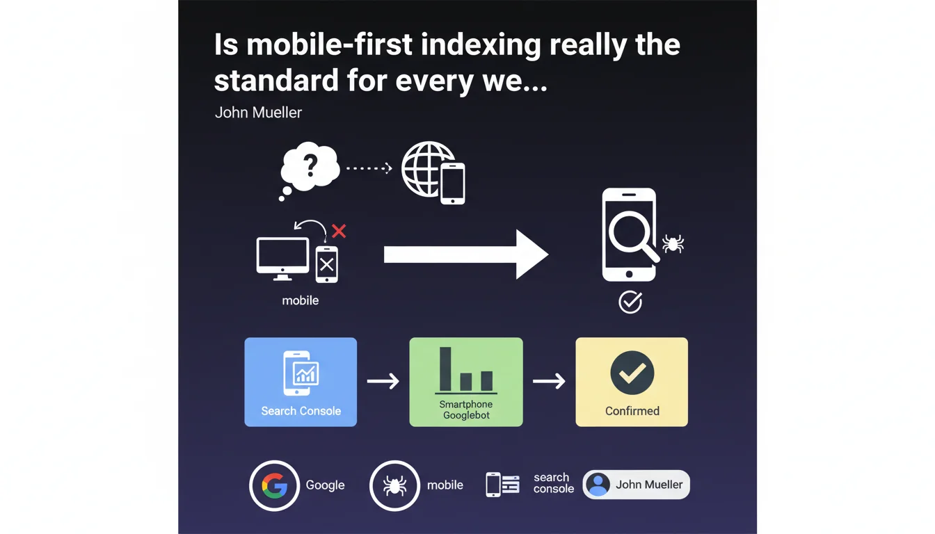
Google confirms that virtually all websites are now crawled and indexed via their mobile version. Verification is simple in Search Console: if the smartphone Googlebot dominates your crawl statistics, your site is properly on mobile-first indexing. This is no longer a gradual transition but an established reality for the vast majority of the web.
What you need to understand
What does this mobile-first generalization really mean in practice?
Mobile-first indexing is no longer an experiment or a transition phase. Google now uses your website's mobile version as the primary reference to determine your ranking, even for searches performed from a desktop computer.
Concretely? The smartphone Googlebot crawls your site, analyzes its content, structure, and performance. This version feeds Google's index. The desktop version becomes secondary — or even ignored if it differs significantly from the mobile version.
How can I verify if my site is affected?
Mueller suggests a simple method: check your crawl statistics in Search Console. If the smartphone Googlebot represents the vast majority of your crawls, it's confirmed.
No need for complex tools. The data is already in your console, under "Settings" then "Crawl statistics". Look at the distribution between Desktop Googlebot and Smartphone Googlebot over the last few months.
What has changed since mobile-first started?
Google began this transition several years ago. Initially, only certain sites were migrated gradually. Today, Mueller uses the phrase "virtually all" — which means that exceptions have become extremely rare.
Sites still indexed on desktop-first are probably special cases: very old sites never updated, specific technical configurations, or niche domains. For 99% of active sites, mobile-first is the standard.
- Mobile-first indexing is no longer optional or gradual — it concerns nearly the entire web
- The smartphone Googlebot has become the reference crawler for determining your ranking
- Verification is done directly in Search Console via crawl statistics
- Differences between mobile and desktop versions can now severely penalize your visibility
- This generalization makes old strategies favoring desktop obsolete
SEO Expert opinion
Does this statement really reflect what's happening in the field?
Let's be honest: yes, absolutely. Real-world observations massively confirm this finding. The majority of sites we audit show 95%+ of crawls by smartphone Googlebot. The exceptions are so rare that they've become anomalies.
What's interesting is that Mueller uses "virtually all" rather than a categorical "all". Diplomatic caution or acknowledgment that some pockets of resistance remain? Probably a bit of both. But for a practitioner, assume your site is affected — unless there's clear evidence to the contrary in your stats.
What nuances should be added to this message?
The main nuance concerns dynamic content and mobile/desktop differences. Many sites still display reduced or truncated content on mobile — closed accordions by default, hidden tabs, poorly implemented lazy-loaded images.
Google crawls and indexes what it sees on the mobile side. If your strategic content is hidden behind three clicks or temperamental JavaScript, you have a problem. And Mueller doesn't delve into these subtleties — he simply states the general fact.
Another point: mobile performance now counts double. Not only for Core Web Vitals, but also because it's the version used to evaluate your site's overall quality. A slow mobile site is a slow site in Google's eyes.
Are there still situations where desktop takes priority?
Frankly? Almost none. Even for B2B sectors where the audience is predominantly desktop-based, Google indexes the mobile version.
The only scenario where you might still see dominant desktop crawling is if Google hasn't yet migrated your site — but given Mueller's statement, that would indicate a technical issue blocking the migration. Check your logs, your mobile robots.txt, your redirects.
Practical impact and recommendations
What should you check immediately on your site?
First action: open Search Console, go to Settings > Crawl statistics. Look at the Desktop/Smartphone distribution over the last 90 days. If smartphone doesn't represent 90%+, investigate why.
Next, compare your mobile and desktop versions — not just visually, but in terms of actually accessible content. Use Search Console's URL inspection tool in mobile mode to see what Googlebot actually sees.
- Check the Desktop/Smartphone distribution in Search Console crawl statistics
- Compare visible content on mobile vs desktop — text, images, links, structured data
- Test mobile rendering with Google's URL inspection tool
- Audit mobile performance (Core Web Vitals, loading time, interactivity)
- Verify that content hidden by default (accordions, tabs) remains crawlable
- Control that critical resources (CSS, JS, images) aren't blocked on mobile
- Ensure canonical tags point correctly between mobile and desktop
- Validate that structured data is identical on both versions
What mistakes must you absolutely avoid?
The classic error: assuming "responsive" = "mobile-first compatible". A responsive site can easily hide critical content on mobile, load differently, or subtly degrade the user experience.
Another common trap: neglecting structured data differences between mobile and desktop. If your structured data is only present on desktop, Google won't see it anymore. Same logic for heading tags, alt attributes, and internal linking.
And that's where it often gets tricky — many sites have accumulated years of desktop optimizations without ever checking their mobile equivalence. Result: insidious visibility losses that are difficult to diagnose.
How should you adapt your SEO strategy to this reality?
Reverse your work logic: design for mobile first, then adapt to desktop if necessary. Test your optimizations on mobile as a priority. Audit your KPIs with mobile-first data.
For redesigns or new site projects, responsive design is no longer optional but an absolute prerequisite. "Separate mobile" approaches (m. subdomains, separate versions) have become structural handicaps.
❓ Frequently Asked Questions
Comment savoir si mon site est bien en indexation mobile-first ?
Mon site responsive est-il automatiquement compatible mobile-first ?
Que se passe-t-il si mon contenu mobile est moins riche que mon desktop ?
Les Core Web Vitals sont-elles plus importantes avec le mobile-first ?
Existe-t-il encore des sites indexés en desktop-first ?
🎥 From the same video 14
Other SEO insights extracted from this same Google Search Central video · published on 11/07/2023
🎥 Watch the full video on YouTube →
💬 Comments (0)
Be the first to comment.