Official statement
Other statements from this video 12 ▾
- □ Pourquoi le mobile représente-t-il désormais plus de la moitié du trafic de recherche ?
- □ Comment Google Search Console peut-elle vraiment diagnostiquer vos problèmes d'indexation mobile ?
- □ Faut-il vraiment utiliser un sitemap et Google Merchant Center pour être correctement indexé ?
- □ Pourquoi la vitesse mobile reste-t-elle le talon d'Achille de la plupart des sites web ?
- □ Pourquoi PageSpeed Insights combine-t-il données de laboratoire et données terrain ?
- □ Le rapport d'utilisabilité mobile de la Search Console est-il vraiment suffisant pour optimiser son site ?
- □ Le Mobile Friendly Test détecte-t-il vraiment les problèmes qui impactent votre SEO mobile ?
- □ Un design mobile simplifié suffit-il vraiment pour tous les écrans ?
- □ Pourquoi les différences mobile/desktop ruinent-elles votre stratégie e-commerce ?
- □ Le responsive web design est-il toujours la meilleure stratégie pour le SEO cross-device ?
- □ Faut-il vraiment afficher tout son contenu en version mobile pour bien se positionner ?
- □ Le défilement infini tue-t-il vraiment l'exploration de vos pages produits ?
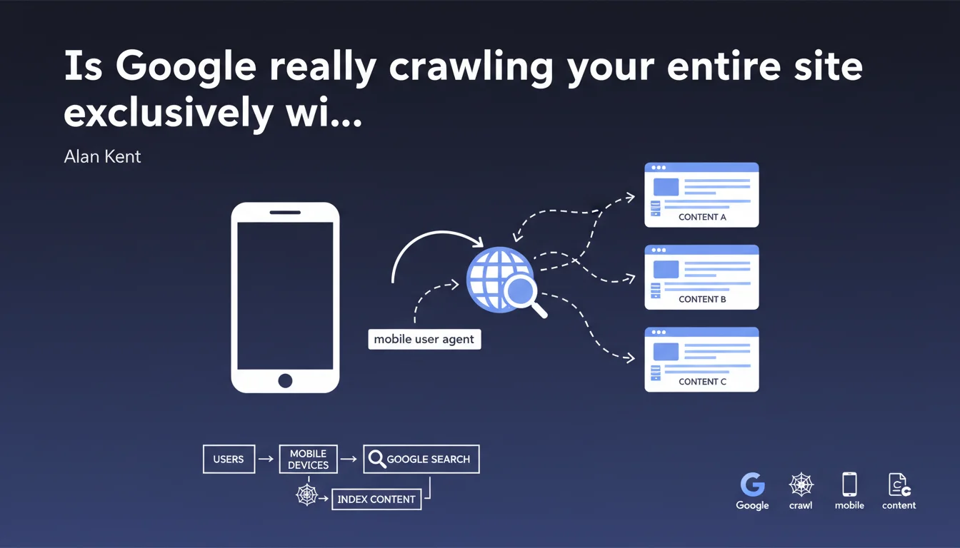
Google now crawls and indexes the entire web using a mobile user agent in HTTP headers, because the majority of searches happen on smartphones. This statement officially confirms that your desktop site version no longer matters for SEO — it's the mobile rendering that determines your rankings.
What you need to understand
What does mobile-first indexing actually mean in practice?
Mobile-first indexing means that Googlebot systematically uses a mobile user agent when crawling your site to build its index. The User-Agent HTTP header it sends simulates a smartphone, not a desktop computer.
This approach replaced the old method where Google crawled primarily with a desktop user agent. Now, even if you search Google from a desktop computer, the results come from an index built from mobile crawling.
Why did Google make this switch?
The answer comes down to one figure: the majority of search queries come from mobile devices. Alan Kent states it plainly — it's about aligning the indexing method with actual user behavior.
Maintaining two separate indexes (one for desktop, one for mobile) no longer made economic or technical sense when 60 to 70% of traffic comes via smartphone. Google chose the version that reflects how the majority of users actually search.
What changes technically for my website?
If your site serves different content based on user agent, it's the mobile version that will be indexed — not the desktop version. This applies to HTML served, resources loaded (CSS, JS), and images displayed.
Responsive websites theoretically don't need to change anything since they serve the same HTML regardless of the request. However, configurations with separate URLs (m.example.com) or dynamic serving must verify that content parity between mobile and desktop is strict.
- Googlebot uses a mobile user agent to crawl and index all websites
- This practice stems from the dominance of mobile traffic in search queries
- Only the mobile version of your content feeds Google's index
- Sites with different desktop/mobile content must ensure complete parity
- Responsive design remains the simplest solution to avoid discrepancies
SEO Expert opinion
Is this statement consistent with real-world observations?
Yes, unsurprisingly. Mobile-first indexing isn't new — Google has been communicating about it for years and deployed it progressively. Alan Kent's statement simply confirms that the switch is complete and irreversible.
In practice, server logs show almost exclusively mobile user agents for Googlebot. Rare desktop crawls involve specific tests or secondary crawls, not primary indexing.
What nuances should be added to this claim?
Google mentions "most users" but remains vague about the exact threshold. [To verify]: what percentage of mobile searches justifies this complete switch? For some B2B or niche technical sectors, desktop may still represent 50% or more of traffic.
The statement also implies that the mobile user agent is sufficient to evaluate the quality and relevance of a site, which raises questions. A site perfectly readable on desktop but mediocre on mobile will be penalized, even if its real audience is mostly desktop. Google has decided: the index is mobile, period.
In what cases does this rule cause problems?
Sites that serve truncated content on mobile for performance or UX reasons are shooting themselves in the foot. If you hide entire sections, reduce text, or defer image loading through aggressive lazy loading, mobile Googlebot may never see that content.
Another problematic case: sites with intrusive popups or interstitials on mobile. Google already penalizes them, but with mobile-first indexing, these elements become even more visible during crawling. A popup blocking access to main content will be detected systematically.
Practical impact and recommendations
What should you do concretely to adapt?
First, check in Search Console that your site has been switched to mobile-first indexing. Google sends a notification, but it can be overlooked. Check server logs: if Googlebot arrives exclusively with a mobile user agent, it's confirmed.
Second, carefully compare the mobile and desktop versions of your key pages. Open DevTools, simulate mobile, inspect the DOM. Text content, title/meta tags, structured data, internal links — everything must be identical. No hidden content, no lazy loading that prevents indexing.
Third, test mobile rendering with the URL inspection tool in Search Console. Verify that the HTML received by mobile Googlebot matches what you expect. Check for blocked resources, JavaScript errors, and load time.
What mistakes should you absolutely avoid?
Never serve a stripped-down mobile version "for performance reasons". If you remove paragraphs, images, or links on mobile, Google will never see them — and your SEO will suffer.
Avoid disguised cloaking techniques: serving different content based on user agent remains risky. If you absolutely must distinguish between mobile and desktop (dynamic serving), research best practices and use the Vary: User-Agent header correctly.
Don't neglect Core Web Vitals on mobile. Mobile Googlebot also evaluates performance — catastrophic LCP, CLS that shifts the page layout, it all matters. Mobile-first indexing isn't just about content, but the entire experience.
How do you verify that your site is compliant?
- Go to Search Console and confirm your site's mobile-first indexing status
- Compare mobile vs desktop HTML source on your strategic pages (diff tool recommended)
- Test mobile rendering with the URL inspection tool and check for JavaScript/CSS errors
- Analyze your server logs: Googlebot user agent should be mobile 95%+
- Verify that structured data (Schema.org) appears correctly in mobile version
- Check that important images have alt attributes and are accessible on mobile
- Measure Core Web Vitals specifically on mobile (Lighthouse, PageSpeed Insights)
- Ensure robots.txt and sitemap.xml files are consistent with mobile crawling
❓ Frequently Asked Questions
Google crawle-t-il encore avec un user agent desktop ?
Mon site responsive est-il automatiquement compatible mobile-first indexing ?
Que se passe-t-il si ma version mobile a moins de contenu que la version desktop ?
Les annotations hreflang doivent-elles apparaître sur mobile ?
Comment savoir si mon site est passé en mobile-first indexing ?
🎥 From the same video 12
Other SEO insights extracted from this same Google Search Central video · published on 02/06/2022
🎥 Watch the full video on YouTube →
💬 Comments (0)
Be the first to comment.