Official statement
Other statements from this video 10 ▾
- □ L'accessibilité web est-elle devenue un critère SEO incontournable ?
- □ Pourquoi Google insiste-t-il autant sur le contraste des couleurs pour le SEO ?
- □ L'espacement et la structure du texte influencent-ils le classement Google ?
- □ Pourquoi l'ordre de tabulation au clavier impacte-t-il votre SEO ?
- □ Faut-il vraiment implémenter des skip links pour améliorer son SEO ?
- □ Faut-il vraiment tester l'accessibilité avec les lecteurs d'écran natifs pour le SEO ?
- □ Pourquoi l'éducation en accessibilité doit-elle précéder l'audit technique ?
- □ La taille du texte est-elle vraiment un critère de classement Google ?
- □ Pourquoi l'accessibilité améliore-t-elle vraiment la localisation SEO de vos contenus ?
- □ Pourquoi 90% des sites web échouent-ils sur les critères d'accessibilité et quel impact SEO ?
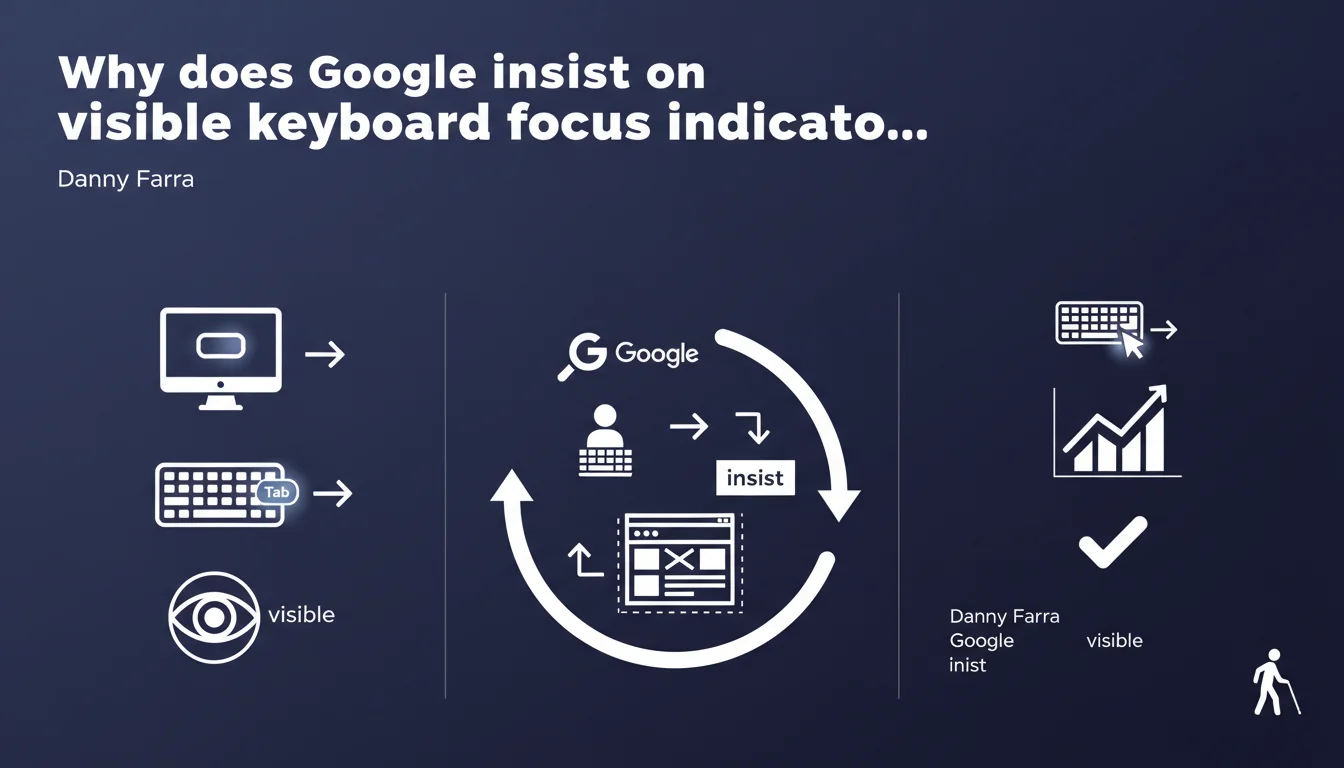
Google requires that every element receiving keyboard focus display a visible indicator with sufficient contrast. This directive targets keyboard navigation users without screen readers—a population often overlooked in accessibility audits. The absence of these indicators can now impact Google's perception of your site's quality.
What you need to understand
Who is affected by this technical requirement?
Keyboard navigation users represent a larger population than commonly believed. We're talking about people with motor disabilities, but also developers, power users who prefer keyboard over mouse, and users experiencing temporary mobility restrictions.
The important nuance: Google specifies "without using a screen reader". These users can see the screen but cannot use the mouse. They rely entirely on the Tab key to navigate and must know visually where the focus is located.
What does a compliant focus indicator look like?
A focus indicator is not just a default browser blue outline. Google is talking about good contrast, which refers to WCAG 2.1 level AA criteria: a minimum contrast ratio of 3:1 between the indicator and the background.
Concretely, this means your custom CSS outline must be sufficiently visible, regardless of background color. Designers love removing default outlines to "clean up" the interface—that's exactly what Google is calling out.
How does this differ from standard accessibility requirements?
Technical SEO audits typically focus on screen readers: alt text, semantic HTML structure, ARIA. But visible focus indicators concern another dimension of accessibility, often forgotten.
Google is therefore expanding its requirement scope. It's no longer just "does your site work with a screen reader," but "is your site usable for ALL alternative navigation modes".
- Every link, button, form field must display a visible indicator on keyboard focus
- The contrast of this indicator must respect a minimum ratio of 3:1
- This requirement applies to custom interactive elements as well (dropdowns, modals, carousels)
- CSS
outline: nonewithout a visible alternative is now a technical red flag
SEO Expert opinion
Is this directive consistent with signals observed in the field?
Yes, and it fits into a strong trend. Core Web Vitals integrated interaction metrics (INP), and Google is multiplying signals about the importance of real user experience beyond simple loading time.
We observe that sites with failing keyboard accessibility often have high bounce rates on certain traffic segments. Google can technically detect these behaviors via the Chrome User Experience Report.
What does Danny Farra say that Google doesn't say publicly?
The term "essential" is strong. Google rarely uses this language in its technical recommendations—usually it's "recommended" or "best practice". Here, Danny Farra raises the stakes.
Let's be honest: [To be verified] Google has never officially confirmed that missing focus indicators directly impact ranking. But the terminology used suggests it could influence overall site quality signals, similar to mobile compatibility or CWV.
What interpretation mistakes should be avoided?
First mistake: thinking a default browser outline is enough. No. If your CSS reset includes * { outline: none }, you're in violation, even if technically an outline exists in the DOM.
Second mistake: thinking this only concerns forms. False. Every interactive element is affected: navigation links, social share buttons, accordions, tabs, custom sliders. And that's where it gets tricky—how many sites have tested their hero carousel with keyboard navigation?
Practical impact and recommendations
How do you quickly audit your site's status?
First method: unplug your mouse and navigate using the Tab key. Do you see where you are at each step? If at any point you lose track, the indicator is missing or invisible.
Second method: use Chrome DevTools. Lighthouse tab, Accessibility section—look for errors related to "focusable elements must have focus indicators". But be careful, Lighthouse doesn't catch everything, especially subtle contrast issues.
What corrections should you prioritize?
Start with your global CSS. If you have a reset that removes outlines, replace it with a visible alternative: :focus { outline: 2px solid #your-color; outline-offset: 2px; }. The offset improves readability.
Then review your custom JavaScript components. Dropdowns, modals, tabs—they must all manage focus programmatically with element.focus() and display an indicator.
Should you treat all elements the same way?
No. Main navigation and forms are absolute priority—these are the most frequently used keyboard areas. Secondary elements (footer, sidebars) can be addressed in a second phase.
But watch out for this trap: invisible focus on call-to-action buttons is a real conversion problem. If your "Buy" or "Sign Up" button loses visual focus, you lose customers—and Google can measure this through engagement data.
- Test complete keyboard navigation across all page templates
- Verify the contrast ratio of focus indicators (tool: WebAIM Contrast Checker)
- Audit JavaScript components for tab-trapping or poorly managed focus
- Fix the CSS reset if
outline: noneis global - Implement
:focus-visibleto refine display based on navigation mode - Document focus patterns in your design system for future updates
❓ Frequently Asked Questions
Un outline par défaut du navigateur suffit-il ou faut-il le personnaliser ?
Les éléments non interactifs doivent-ils aussi avoir un indicateur de focus ?
Comment gérer le focus sur les composants JavaScript complexes comme les modales ?
Le CSS :focus-visible change-t-il quelque chose à cette exigence ?
Google pénalise-t-il directement les sites sans indicateurs de focus ?
🎥 From the same video 10
Other SEO insights extracted from this same Google Search Central video · published on 11/08/2022
🎥 Watch the full video on YouTube →
💬 Comments (0)
Be the first to comment.