Official statement
Other statements from this video 8 ▾
- □ La vitesse de page est-elle vraiment un facteur de classement déterminant ?
- □ Les images sont-elles vraiment le principal frein aux performances de votre site ?
- □ Faut-il vraiment migrer toutes vos images vers WebP pour améliorer votre SEO ?
- □ Les scripts tiers sabotent-ils réellement vos Core Web Vitals même quand ils ne s'affichent pas ?
- □ Lighthouse et DevTools suffisent-ils vraiment pour diagnostiquer le JavaScript inutilisé ?
- □ Le lazy loading est-il vraiment sans risque pour le référencement naturel ?
- □ L'attribut loading=lazy suffit-il vraiment pour optimiser le chargement des images en SEO ?
- □ Faut-il vraiment précharger les vidéos avec une image d'affiche pour le SEO ?
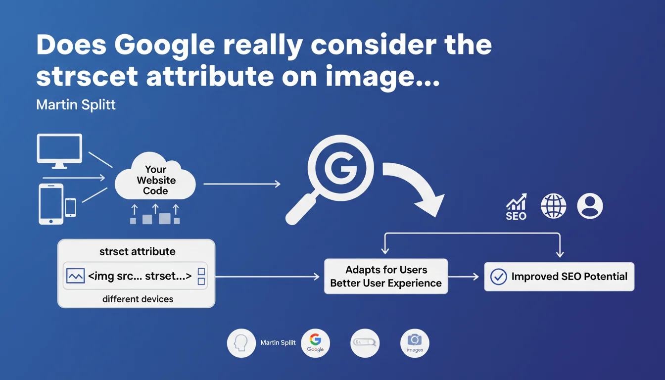
Google confirms that the srcset attribute on <img> and <picture> tags allows serving optimized images according to the user's device. This practice improves user experience and, indirectly, search engine rankings by optimizing load times and Core Web Vitals.
What you need to understand
Why is Google talking about srcset now?
The srcset attribute is not new — it has existed for years in HTML5 specifications. But Martin Splitt, Developer Advocate at Google, reminds us here that this attribute is recognized and understood by Googlebot.
Concretely, srcset allows you to define multiple versions of the same image (different resolutions, sizes) and let the browser choose the most suitable one based on screen size, pixel density, or bandwidth. Google crawls these variants and can therefore index the most relevant version.
What is the connection between srcset and SEO?
Directly? None. Google has never said that srcset is a ranking factor in itself. But indirectly, the impact is real: serving a lightweight image to mobile and an HD version to desktop reduces page weight, improves LCP (Largest Contentful Paint), and boosts Core Web Vitals.
And since Core Web Vitals influence rankings, especially on mobile, using srcset becomes an indirect but measurable optimization lever.
Does Google crawl all the images in the srcset?
No. Google generally selects one or two versions from those declared in srcset, often the default version (src) and a variant with different resolution. It does not systematically download all the variations to save crawl budget.
This means that if you have 5 variants of the same image, Google will probably only index one or two. But that is enough for the algorithm to understand the context and quality of the image.
- The srcset attribute is recognized and crawled by Googlebot
- It indirectly improves SEO via Core Web Vitals
- Google does not crawl all variants, but a representative selection
- Using srcset does not replace image optimization (compression, modern formats)
SEO Expert opinion
Is this statement consistent with practices observed in the field?
Yes, absolutely. For several years, we have observed that sites using srcset and <picture> achieve better Lighthouse and PageSpeed Insights scores, especially on mobile. A/B tests show measurable gains on LCP and CLS.
But let's be honest: many sites still neglect this optimization. Either through lack of knowledge, or because their CMS does not automatically generate image variants. WordPress, for example, has done this natively since version 4.4 — but the theme must exploit it correctly.
What nuances should be added to this recommendation?
First nuance: srcset is not a miracle cure if your base images are poorly optimized. A 3 MB JPEG served in 5 variants remains a burden, even with srcset. You must first compress, resize, and convert to modern formats (WebP, AVIF).
Second nuance: srcset is not always the best solution. For illustration images without resolution concerns (icons, logos), an SVG or a lightweight fixed image is sufficient. No need to multiply variants for a 5 KB pictogram.
Third point: Google says nothing about lazy loading. Yet combining srcset with loading="lazy" is often more impactful than srcset alone. [To verify]: no official Google data quantifies the real impact of srcset on rankings, just on user experience.
In what cases does this technique cause problems?
Mainly on sites with many dynamic or on-the-fly generated images. Creating 4-5 versions of each uploaded image requires server processing and storage. On an e-commerce site with 50,000 products with 10 photos each, this quickly becomes unmanageable without a CDN or automated generation system.
Another case: sites with images hosted on third-party domains (external CDNs, third-party platforms). If the CDN does not support srcset or does not generate variants, you are blocked.
Practical impact and recommendations
What specifically should you do to implement srcset?
If you use a modern CMS (WordPress, Shopify, Webflow), first check if it automatically generates image variants. WordPress does this natively, but your theme must correctly insert the srcset attribute into the HTML code.
If not, install an image optimization plugin that generates the variations (Imagify, ShortPixel, EWWW Image Optimizer). Configure it to create at least 3 sizes: mobile (~480px), tablet (~768px), desktop (~1200px).
For custom or bespoke developed sites, implement srcset directly in your templates. Example of clean syntax:
<img src="image.jpg" srcset="image-480w.jpg 480w, image-768w.jpg 768w, image-1200w.jpg 1200w" sizes="(max-width: 768px) 100vw, 50vw" alt="Description">
What errors should you avoid when implementing?
Classic mistake: forgetting the sizes attribute. Without it, the browser does not know which variant to choose and defaults to the largest. Result: no performance gain. The sizes attribute tells the browser the intended display width according to the viewport.
Another mistake: generating too many variants. 3 to 4 are more than enough to cover 95% of use cases. More than 5 variants is wasteful storage and server bandwidth without measurable gain.
Finally, do not neglect the fallback (the classic src attribute). If srcset fails or if the browser does not support it (very rare today, but it happens), the fallback image must be of decent quality and optimized.
How do you verify that srcset works correctly?
First test manually: open your site on mobile, tablet, and desktop, inspect the source code, and verify that the browser is loading different images according to the device. Chrome DevTools > Network allows you to see which variant is downloaded.
Then run your pages through Google Search Console and check the Core Web Vitals reports. If the LCP improves after implementing srcset, then it is working. Compare before/after on PageSpeed Insights as well.
- Verify that the CMS or theme automatically generates srcset
- Create at least 3 variants per image (mobile, tablet, desktop)
- Always include the sizes attribute with srcset
- Compress and convert images before generating variants (WebP, AVIF)
- Test actual loading on different devices via DevTools
- Monitor the impact on Core Web Vitals in Search Console
- Never leave a 404 URL in srcset
❓ Frequently Asked Questions
L'attribut srcset remplace-t-il l'attribut src classique ?
Google indexe-t-il toutes les variantes d'images dans srcset ?
Est-ce que srcset améliore directement le classement dans Google ?
Dois-je utiliser srcset sur toutes mes images ?
Quelle est la différence entre srcset et la balise <picture> ?
🎥 From the same video 8
Other SEO insights extracted from this same Google Search Central video · published on 29/11/2023
🎥 Watch the full video on YouTube →
💬 Comments (0)
Be the first to comment.