Official statement
Other statements from this video 10 ▾
- □ L'accessibilité web est-elle devenue un critère SEO incontournable ?
- □ L'espacement et la structure du texte influencent-ils le classement Google ?
- □ Pourquoi l'ordre de tabulation au clavier impacte-t-il votre SEO ?
- □ Faut-il vraiment implémenter des skip links pour améliorer son SEO ?
- □ Pourquoi Google insiste-t-il sur l'indicateur de focus clavier visible ?
- □ Faut-il vraiment tester l'accessibilité avec les lecteurs d'écran natifs pour le SEO ?
- □ Pourquoi l'éducation en accessibilité doit-elle précéder l'audit technique ?
- □ La taille du texte est-elle vraiment un critère de classement Google ?
- □ Pourquoi l'accessibilité améliore-t-elle vraiment la localisation SEO de vos contenus ?
- □ Pourquoi 90% des sites web échouent-ils sur les critères d'accessibilité et quel impact SEO ?
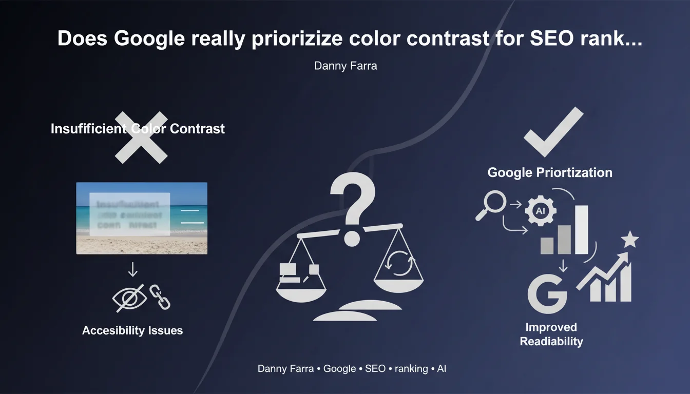
Google identifies insufficient color contrast as one of the most common accessibility issues on the web. Light gray text, overlays without solid backgrounds, and poorly contrasted elements harm readability — and potentially impact rankings. Accessibility is no longer optional.
What you need to understand
Why does contrast actually impact your SEO performance?
Google has always prioritized user experience in its ranking criteria. Unreadable text for a portion of visitors signals a low-quality site.
Insufficient contrast generates negative signals: high bounce rate, low engagement time, rapid abandonment. These behavioral metrics directly influence your search positioning.
What exactly counts as insufficient contrast?
Light gray text (#CCCCCC) on white background (#FFFFFF), a title overlaid on a photo with no dark layer, a small font caption on a gradient — these are everyday situations that fail accessibility tests.
The WCAG (Web Content Accessibility Guidelines) mandate a minimum contrast ratio: 4.5:1 for standard text, 3:1 for large fonts. These standards aren't theoretical — Chrome DevTools verifies them natively.
Why does Danny Farra emphasize text over images so much?
Because it's the most widespread mistake. Designers love hero sections with white text over photos, without worrying about actual readability.
Without a solid background or semi-transparent overlay, text becomes invisible depending on the light and dark zones of the image. Google detects this, visually impaired users notice it — and they leave your site.
- Direct UX impact: a visitor who can't read will abandon the page
- Legal compliance: some jurisdictions mandate accessibility (ADA in the USA, RGAA in France)
- Quality signal: an accessible site is perceived as better designed
- Crawl and indexing: Google values structured and readable content
- Core Web Vitals: poorly contrasted elements can sometimes slow down layout understanding
SEO Expert opinion
Is this statement actually consistent with what we observe in practice?
Yes, and it's arguably an understatement. Lighthouse/PageSpeed audits have been flagging contrast issues for years — yet 70% of auditable sites still fail this check.
We see corporate sites with gray CTA buttons on off-white backgrounds. E-commerce sites with prices in #999 on #FFF. Blogs with dates in 10px light gray. All of this goes live without triggering any alerts on the team side.
What important nuances should we mention about this recommendation?
Danny Farra doesn't say that contrast directly impacts rankings — he's talking about accessibility. Important distinction: Google has never confirmed "color contrast" as a ranking factor.
What is documented is that overall accessibility influences behavioral signals (engagement, bounce rate). Contrast is part of that, just like keyboard navigation or alt attributes.
[Worth verifying] The claim that it's "one of the most frequent issues" lacks solid data. Frequent where? On what samples? Google publishes no consolidated statistics on this topic.
When can this rule actually be relaxed?
Never for main content. But some decorative or secondary elements can technically escape strict ratios — let's be realistic, nobody checks the contrast of a gray divider line.
Be careful though: automated tools don't make this distinction. A Lighthouse audit will flag every text element, even legal mentions in the footer. You need to make smart judgment calls.
Practical impact and recommendations
What concrete steps should you take to improve contrast?
Start with an automated audit using Lighthouse or WAVE. Identify all elements below the WCAG AA threshold (4.5:1). Fix the most critical ones first: headings, CTAs, prices, navigation.
For text over images, systematically add a semi-transparent overlay or solid background behind the text. CSS backdrop-filter or a simple div with opacity: 0.6 works fine.
What critical mistakes should you absolutely avoid?
Never trust your eye. What looks "readable" on your calibrated 4K monitor might not be legible on a budget laptop in sunlight.
Avoid light gray text (#777, #999) by default. Prefer #333 or #000 on light backgrounds. And never, ever overlay light text on an image without protection.
How do you verify your site is actually compliant?
Use WebAIM's Contrast Checker tool to test your color pairs. Chrome DevTools displays the contrast ratio directly in the CSS inspector.
Test with real users: older adults, people with mild vision impairment. Their feedback beats any automated score.
- Audit all text elements with Lighthouse (Accessibility score > 90)
- Check contrast ratio for headings, CTAs, prices, links
- Add overlays to all text overlaid on images
- Replace light grays (#CCC, #999) with darker values (#555, #333)
- Test in both dark mode AND light mode
- Validate with real users in actual conditions (mobile, outdoors)
- Document color choices in a style guide
- Automate contrast testing in your CI/CD pipeline
❓ Frequently Asked Questions
Le contraste des couleurs est-il un facteur de classement direct ?
Quel ratio de contraste minimum respecter ?
Comment tester le contraste de mon site rapidement ?
Les textes sur images posent toujours problème même avec un overlay ?
Faut-il corriger tous les éléments flagués par Lighthouse ?
🎥 From the same video 10
Other SEO insights extracted from this same Google Search Central video · published on 11/08/2022
🎥 Watch the full video on YouTube →
💬 Comments (0)
Be the first to comment.