Official statement
Other statements from this video 10 ▾
- □ Has web accessibility become an unavoidable SEO criterion?
- □ Does Google really prioritize color contrast for SEO rankings, and should you care?
- □ Does text spacing and structure really influence your Google rankings?
- □ Does your keyboard tab order really impact SEO rankings?
- □ Do skip links really improve your SEO, or are they just an accessibility checkbox?
- □ Why does Google insist on visible keyboard focus indicators for all interactive elements?
- □ Should you really test accessibility with native screen readers for SEO purposes?
- □ Why Should Accessibility Education Come Before Technical Auditing?
- □ Does accessibility really boost your content's international SEO performance across multiple languages?
- □ Did you know that 90% of websites fail accessibility criteria—and what's the real SEO impact?
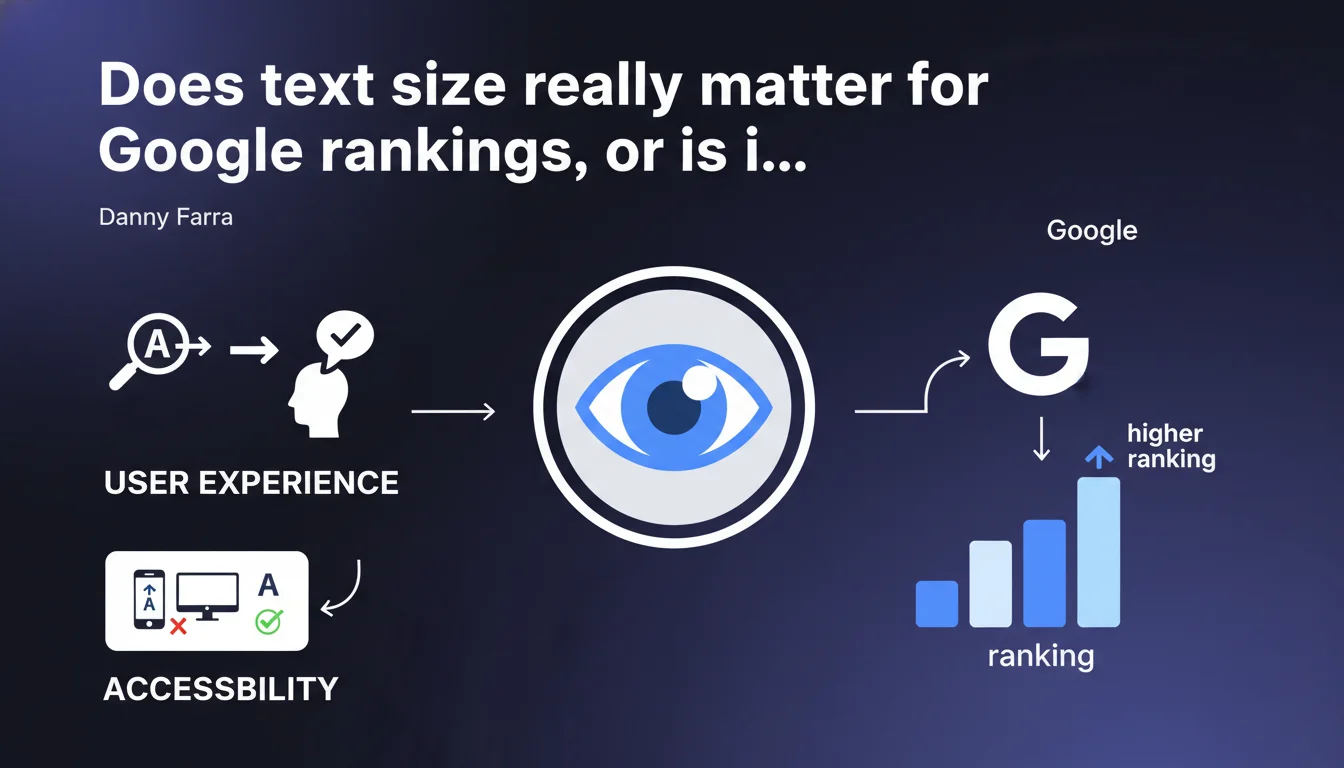
Google states that text that is too small reduces accessibility and all textual elements on a page, even decorative ones, should be large enough to be easily readable. This statement targets visual accessibility, but its impact on organic ranking remains unclear — Google doesn't specify a minimum threshold or direct SEO consequences.
What you need to understand
Why does Google insist on text size?
Danny Farr's statement reflects Google's ongoing efforts to improve user experience and web accessibility. Text that is too small hurts readability, especially on mobile, and effectively excludes part of your visitors — people with visual impairments, users on small screens, difficult reading contexts.
What's striking is the absence of precise technical guidelines. Google talks about text being "easily readable," but gives neither a minimum pixel value nor a testing method. We're left with general advice, not operational instructions.
Are all texts concerned, even decorative ones?
Yes, and that's where it gets interesting. Google explicitly states that even elements considered decorative must follow this readability rule. So no more legal notices in 8px, microscopic footers, or illegible badges.
This raises a question: does Google distinguish between purely decorative text (a stylized slogan in SVG, for example) and miniaturized informational text? The answer isn't clear. [To verify] whether this applies to text embedded in images or visual components.
What's the link between accessibility and SEO ranking?
Google repeats that accessibility improves overall experience, which indirectly influences user signals (time on page, bounce rate, satisfaction). But it never explicitly says text size is a direct ranking factor.
Core Web Vitals do measure display and visual stability. Text that is too small can impact CLS if elements shift during loading. But again, no clear mechanical link between "text size below X" and "ranking penalty."
- Accessibility = stated priority by Google, but with no precise SEO KPI
- All text must be readable, including decorative elements
- No technical threshold officially communicated (16px often recommended in UX, but not enforced by Google)
- Indirect SEO impact through user signals, no confirmed ranking factor
SEO Expert opinion
Is this statement consistent with what we observe in practice?
Let's be honest: sites with tiny text rank very well. Footers in 10px, illegible disclaimers, microscopic captions — none of this prevents solid positioning if the rest (authority, content, backlinks) holds up.
What really matters is real user experience. If your text is too small and visitors leave the page in 3 seconds, Google will see it in its behavioral metrics. The problem isn't text size itself — it's what it triggers as a reaction.
What nuances should we add?
Google doesn't distinguish between desktop and mobile, yet it's on mobile where the problem actually occurs. Text at 12px might pass on a 27-inch screen but becomes unreadable on a smartphone without zooming.
Another blind spot: styled or visually integrated text. Can Google really assess its readability? Technically, it would require OCR or rendered contrast analysis — none of this is confirmed. [To verify] whether Google actually analyzes visual readability or just checks declared CSS size.
In what cases does this rule not apply?
There probably is no technical exception in Google's ideal world. But in practice, some elements escape any constraint: text in non-crawled images, content in iframes, elements hidden by default (accordions, closed modals).
And then there's the case of highly visual sites — design portfolios, artist websites, experimental interfaces — where text size is part of the creation. Google has never said it would penalize visual boldness, as long as information remains accessible somehow.
Practical impact and recommendations
What should you do concretely to meet this recommendation?
Start by auditing the minimum text size on your pages, especially on mobile. A generally accepted UX standard: 16px minimum for body text, 14px acceptable for secondary elements (captions, mentions). Below that, you risk losing part of your audience.
Also check the contrast between text and background. Light gray text on white background, even at 16px, remains hard to read. Accessibility tools (Lighthouse, axe DevTools) will flag contrast issues — listen to them.
What mistakes should you absolutely avoid?
Never reduce text size to "fit" content into a layout that's too tight. If your design requires tiny text, it's the design that needs rework, not readability you should sacrifice.
Another trap: text hidden in CSS (font-size: 0, visibility: hidden) to manipulate rendering. Google may see this as cloaking or keyword stuffing. If you need to hide content, use ARIA attributes or accessible techniques.
How do you verify your site is compliant?
Run a Lighthouse audit on your main pages. It detects text that is too small and contrast problems. Cross-check with Google Search Console: if you have alerts related to mobile experience, they may include readability issues.
Test manually on multiple devices. Text that looks fine on an iPhone 14 Pro may be unreadable on an older Android with a 5-inch screen. The human eye remains the best judge.
- Audit minimum text size (16px recommended, 14px minimum acceptable)
- Verify text/background contrast with Lighthouse or axe DevTools
- Test on real mobile devices, not just desktop developer mode
- Avoid hidden or 0px text (cloaking risk)
- Rework design if visual constraints impose unreadable text
- Monitor Search Console alerts related to mobile experience
❓ Frequently Asked Questions
Quelle est la taille minimale de texte recommandée par Google ?
Un texte trop petit peut-il pénaliser mon classement SEO ?
Les mentions légales et footers doivent-ils aussi respecter cette règle ?
Comment tester la lisibilité de mes textes ?
Les textes dans les images sont-ils concernés ?
🎥 From the same video 10
Other SEO insights extracted from this same Google Search Central video · published on 11/08/2022
🎥 Watch the full video on YouTube →
💬 Comments (0)
Be the first to comment.