Official statement
Other statements from this video 7 ▾
- □ Faut-il vraiment utiliser Looker Studio pour monitorer ses performances SEO ?
- □ Comment structurer vos visualisations de données SEO pour exploiter vraiment vos analytics ?
- □ Pourquoi Google recommande-t-il d'analyser la Search Console par tranches de 7 jours ?
- □ Comment exploiter pleinement le data blending pour enrichir vos analyses Search Console ?
- □ Comment analyser la performance Search Console pour Discover et Google News séparément ?
- □ Pourquoi les expressions régulières sont-elles indispensables pour analyser vos données Search Console dans Looker Studio ?
- □ Pourquoi Google insiste-t-il autant sur les clics et le CTR dans Search Console ?
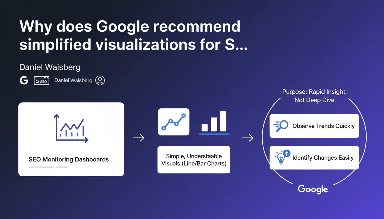
Google favors simple graphics (line charts, bar charts) for SEO monitoring rather than complex dashboards. The objective: quickly spot trends and anomalies, not get bogged down in granular data analysis. An approach that refocuses monitoring on what matters: early problem detection.
What you need to understand
What does this Google recommendation really mean?
Google encourages the use of basic visualizations in SEO dashboards. Goodbye to sophisticated heatmaps or complex multi-axis charts: line graphs and bar charts are sufficient according to Daniel Waisberg.
This stance reveals a precise philosophy of monitoring. It's not about creating fancy reports to impress the executive team — but about building effective alert systems that instantly signal a deviation.
Why does this minimalist approach make sense?
SEO monitoring is not SEO analysis. This distinction is crucial. The first detects, the second explains. When your rankings collapse on a Tuesday morning, you don't need a 47-widget interactive dashboard.
What you need is to see the anomaly in 3 seconds. Then switch to analysis tools to understand the why. Two distinct phases, two different needs.
What are the essential elements to remember?
- Monitoring aims for rapid detection, not deep analysis
- Simple graphs (curves, bars) enable immediate reading of trends
- The objective is to spot sudden changes or progressive deviations
- Visual complexity hurts responsiveness — it slows down the identification of weak signals
- This recommendation implies that Google itself uses sober dashboards internally
SEO Expert opinion
Does this statement truly reflect real-world practices?
Yes and no. In fact, most high-performing SEOs I work with do use basic graphs for daily monitoring. Traffic curves, average positions, crawl rates — nothing sophisticated.
But beware of oversimplification. Some complex issues require more elaborate visualizations: a position heatmap by semantic cluster can reveal patterns invisible on a simple line graph. Google doesn't specify where to draw the line. [To verify]
What nuances should we add to this recommendation?
Simplicity is not synonymous with information poverty. A well-designed simple graph can contain multiple stratified metrics — organic traffic + average positions + click-through rate, for example.
What Google implicitly criticizes is gratuitous complexity: visualizations that demand 2 minutes of mental decoding. If you need to explain how to read your dashboard to a colleague, you've failed.
In what cases does this rule not apply?
For client or executive reporting, the stakes are different. You need to tell a story, not just detect an anomaly. There, more elaborate visualizations have their place.
Same for post-mortem analysis of a penalty or algorithm drop. You'll cross 15 data sources, overlay events, segment by page type. Impossible with a simple line chart. Google's advice applies to operational daily monitoring, not in-depth investigation.
Practical impact and recommendations
What should you concretely implement for effective monitoring?
Rethink your dashboards according to a visual hierarchy logic. At the top: the 3-4 critical metrics in line graphs (organic traffic, average positions, crawl rate). One glance is enough.
Below: secondary segments (mobile vs desktop performance, traffic by page type). Still in bars or curves, but less visually prominent. Keep data tables for CSV export — not for visual monitoring.
What errors should you avoid when building your dashboards?
Don't confuse exhaustiveness with usefulness. I've seen dashboards with 23 different graphs — nobody looks at them. Better to have 5 relevant graphs consulted daily than 20 widgets gathering dust.
Another classic pitfall: poorly calibrated automatic scales. A graph starting at zero when your traffic oscillates between 45,000 and 48,000 visits visually crushes variations. Adjust axes so significant changes are immediately visible.
How do you ensure your monitoring fulfills its role?
- Test the 10-second principle: an external colleague should understand your site's SEO health in less than 10 seconds
- Favor temporal graphs (evolution) over static snapshots
- Configure automatic alerts on critical thresholds — the visual dashboard is a complement, not a replacement
- Limit yourself to 1-2 visualization types maximum (curves + bars, for example)
- Ensure each graph answers a precise question: "Is traffic increasing?" "Which pages are losing rankings?"
- Avoid multiple colors without logic — a coherent color code (green = positive, red = negative) speeds up reading
- Integrate reference lines (moving average, targets) to contextualize data
❓ Frequently Asked Questions
Quels outils permettent de créer facilement des dashboards SEO simples ?
Faut-il abandonner complètement les visualisations complexes en SEO ?
Combien de métriques faut-il suivre dans un dashboard de monitoring SEO ?
Comment définir les seuils d'alerte pertinents sur un dashboard SEO ?
Les visualisations mobiles doivent-elles suivre les mêmes principes ?
🎥 From the same video 7
Other SEO insights extracted from this same Google Search Central video · published on 15/03/2023
🎥 Watch the full video on YouTube →
💬 Comments (0)
Be the first to comment.