Official statement
Other statements from this video 8 ▾
- □ La balise meta keywords sert-elle encore à quelque chose en SEO ?
- □ Utiliser Google Analytics ou Chrome améliore-t-il vraiment votre référencement ?
- □ Pourquoi Google normalise-t-il votre HTML même quand il est cassé ?
- □ Le CSS influence-t-il réellement le poids SEO de vos balises H1-H6 ?
- □ Comment Caffeine ingère-t-il vraiment les données de Googlebot dans l'index ?
- □ Faut-il vraiment dé-optimiser certaines pages pour améliorer ses performances SEO ?
- □ Faut-il vraiment optimiser différemment chaque outil de suppression Google ?
- □ Pourquoi Google ne documente-t-il qu'une seule balise meta dans son guide SEO officiel ?
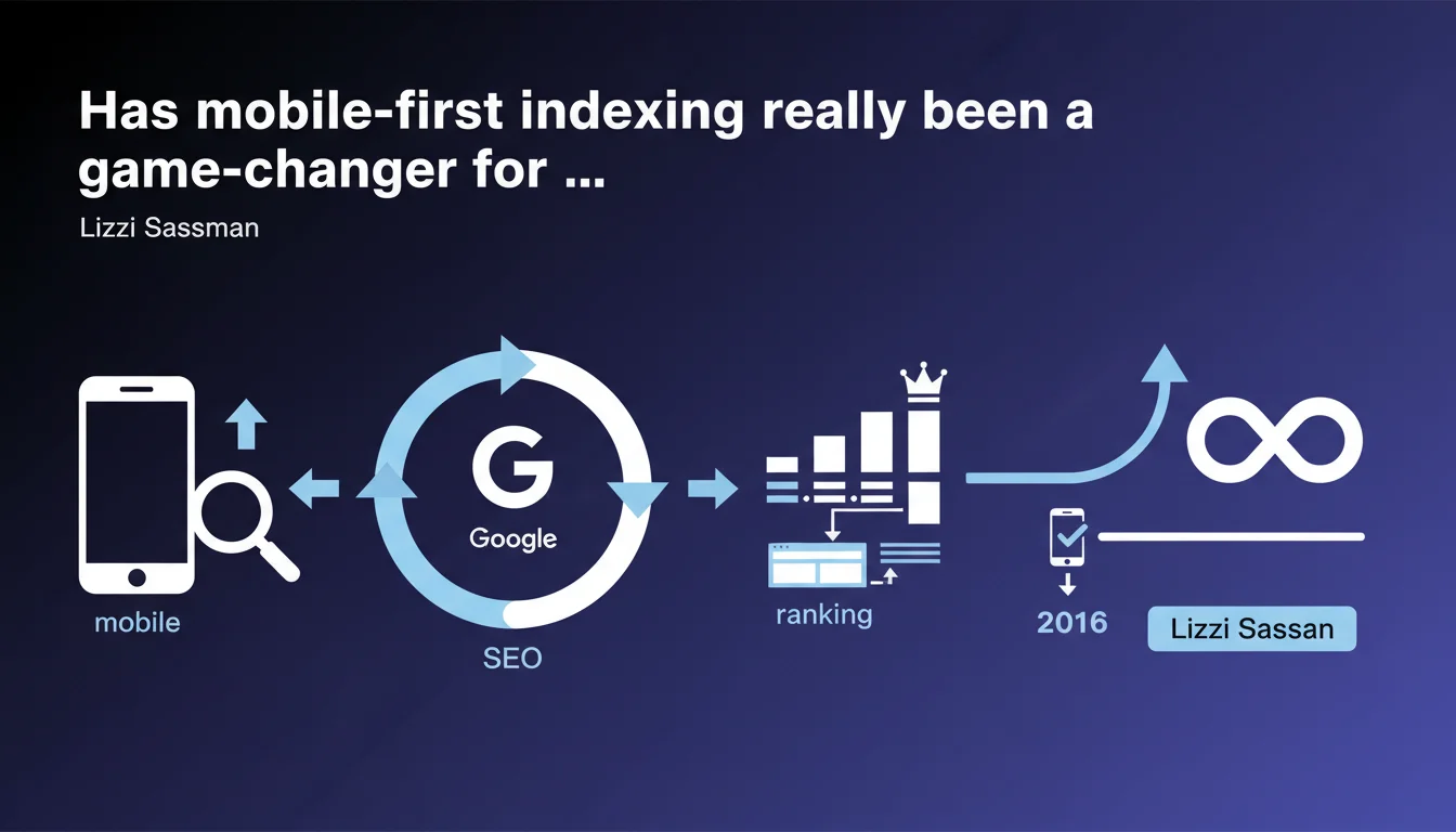
Since late 2016, Google crawls and indexes the mobile version of your pages as its priority, not the desktop version. This shift directly impacts your rankings, rich snippets, and how your structured data is interpreted. If your mobile version is broken or incomplete, you'll lose positions — period.
What you need to understand
What exactly does mobile-first indexing change about crawling?
Before 2016, Googlebot primarily crawled the desktop version of your pages to determine their relevance and ranking position. Even if the end user arrived on mobile, it was the desktop content that mattered.
With mobile-first indexing, Google reverses this logic: the mobile version becomes the reference point. The bot analyzes first what a mobile user sees — text content, images, internal links, structured data. If this version is stripped down or poorly executed, you're penalized, even if your desktop is flawless.
Why did Google switch to this approach?
Because over 60% of searches now happen on mobile. Continuing to index desktop as the priority no longer made sense: users were landing on pages that bore no resemblance to what Google had crawled.
Mobile-first indexing aligns the actual user experience with ranking criteria. It's that straightforward — and it's irreversible.
Which elements are directly affected by this change?
- Text content: if you hide text on mobile (poorly coded accordions, "Read more" without bot-accessible JavaScript), Google doesn't see it.
- Images and media: unoptimized formats, poorly implemented lazy loading, missing alt tags = lost signals.
- Structured data: schema.org present on desktop but missing on mobile? Google ignores it.
- Internal links: truncated site architecture on mobile = loss of SEO juice and incomplete crawling.
- Loading speed: Core Web Vitals measured on mobile as priority since the mobile-first shift.
SEO Expert opinion
Is this statement consistent with what we observe in the field?
Yes, but with a time lag that's sometimes surprising. Google announced mobile-first indexing in late 2016, but the rollout stretched until 2021 for some sites. Result: for years, site owners believed they were mobile-first when they weren't yet.
Concretely? We saw sites lose 20 to 40% of organic traffic overnight when the switch happened — simply because their mobile version hid half the content or used hamburger menus that were opaque to Googlebot. The "mobile-friendly" label in Search Console guaranteed nothing.
What nuances should we apply to this rule?
First nuance: mobile-first doesn't mean mobile-only. If you only have a desktop version (extremely rare today), Google will still crawl it. You won't be blacklisted — just disadvantaged.
Second nuance — and this one is critical: Google continues to crawl the desktop version, but it mainly serves as a backup or verification. If your mobile is incomplete, the bot can compare with desktop to detect inconsistencies. But don't count on that to save a poorly executed mobile site.
display:none on mobile, or if your tabs aren't accessible to the bot, you lose that content in Google's eyes. Responsive design is just a first step.In what cases does this rule still cause problems in 2025?
Sites with heavy editorial content are most affected. Typically: online media, tech blogs, e-commerce sites with long product pages. On desktop, you display 2000 words, comparison tables, rich FAQs. On mobile, you trim to 500 words "for UX".
Result: Google indexes the trimmed version, you lose semantic richness, and competitors who display everything — even on mobile — overtake you. Let's be honest, the UX vs SEO trade-off has never been trickier.
Practical impact and recommendations
What should you check first on your mobile site?
First reflex: manually compare your mobile and desktop versions. Display the same URL on both devices and ask yourself these questions: is the text content identical? Do all images have alt tags? Are all internal links present?
Second step: use the URL inspection tool in Search Console. Ask Google to crawl your page and check which user-agent it uses (smartphone or desktop). Review the HTML rendering: what you see is what Google indexes.
Third check — often overlooked: structured data. Test your schema.org tags with Google's Rich Results Test in mobile mode. If your product stars, FAQs, or breadcrumbs disappear on mobile, you lose rich snippets.
What common mistakes must you absolutely avoid?
- Hiding content behind poorly coded accordions: if the text isn't in the DOM at load, Google might ignore it.
- Using aggressive lazy loading without fallback: unloaded images and videos = lost signals for the bot.
- Removing entire sections on mobile (tables, comparisons, customer reviews) under the guise of lightening the page.
- Forgetting canonical tags: if you serve a dedicated mobile URL (m.example.com), the canonical should point to the main version.
- Neglecting mobile speed: a site that takes 8 seconds to load on 4G loses rankings, even if content is perfect.
How do you ensure your site stays compliant over time?
Set up regular monitoring via Search Console. Check the "Page Experience" report and the "Mobile Usability" report. If Google detects issues (content wider than screen, tap targets too close together), fix immediately.
Test every new feature or redesign on mobile first. And if you deploy A/B tests that modify mobile structure, verify that Googlebot can access all variants. A poorly configured test can block the bot or serve it a degraded version.
🎥 From the same video 8
Other SEO insights extracted from this same Google Search Central video · published on 03/11/2025
🎥 Watch the full video on YouTube →
💬 Comments (0)
Be the first to comment.