Official statement
Other statements from this video 10 ▾
- □ Is CLS really a full-fledged Google ranking factor you can't ignore?
- □ Does specifying image dimensions really fix Cumulative Layout Shift?
- □ Are lab data really enough to optimize your Core Web Vitals, or do you need real user metrics?
- □ How is the Chrome User Experience Report revolutionizing the way you measure your website's actual performance?
- □ Does LCP really measure how fast your main content appears on screen?
- □ Should you really prioritize loading your hero images to improve LCP?
- □ Is lazy loading really hurting your above-the-fold images and LCP?
- □ Why is PageSpeed Insights the performance tool you should prioritize for SEO?
- □ Can HTTP/2 really boost your site's performance without major technical overhaul?
- □ Should you really convert all your images to WebP for SEO?
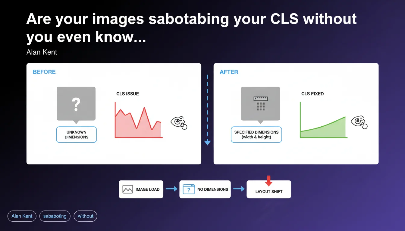
Images without explicit dimensions trigger layout shifts (CLS) because the browser cannot reserve the necessary space before they load. Alan Kent reminds us that a basic integration error — omitting width and height — is enough to degrade Core Web Vitals. The solution has been known for years, yet remains ignored on a significant portion of audited websites.
What you need to understand
Why do images cause Cumulative Layout Shift?
The browser builds the DOM and calculates the layout before external resources (images, in particular) are downloaded. If no dimensions are specified in the HTML, the browser allocates zero pixels of height to the image location.
When the image finally arrives, the browser recalculates the layout to integrate it. All content below shifts abruptly downward. This visual shift is measured as Cumulative Layout Shift, one of the three pillars of Core Web Vitals.
What are the "incorrect uses" that Google is referring to?
Alan Kent's phrasing — "if they are used incorrectly" — primarily designates the absence of width and height attributes on <img> tags. This is the most frequent cause.
Other scenarios include images loaded via JavaScript without space reservation (poorly implemented lazy loading), web fonts that modify line height, or ad banners dynamically injected without a dimensioned container. But the basic error remains the neglect of dimensions.
Does CLS really impact Google rankings?
Yes, since the Page Experience Update, CLS has been part of the ranking signal — but its relative weight remains modest compared to content relevance. Google has said it openly: a disastrous CLS will not tank a well-positioned page if it perfectly matches search intent.
That said, between two pages of equivalent quality, the one displaying better CLS will have an advantage. And most importantly, poor CLS degrades actual user experience: bounce rate, engagement, conversions. The indirect impact can be severe.
- Specifying width and height on each
<img>tag is mandatory to avoid CLS. - The browser uses the intrinsic ratio (width / height) to reserve space, even if the image is resized via CSS.
- Lazy-loaded images must also have explicit dimensions — lazy loading does not exempt from this rule.
- CLS is a weak ranking signal, but its UX impact is measurable on business metrics.
- High CLS will be visible in the Core Web Vitals report in Search Console and may trigger an alert if the "Good" threshold is not met.
SEO Expert opinion
Is this statement consistent with real-world observations?
Absolutely. PageSpeed Insights audits continue to point out images without dimensions as the number one cause of CLS on the majority of analyzed sites. This is not new — Google has recommended specifying width and height since 2020.
What is striking is that this elementary practice remains overlooked. Poorly configured CMS platforms, visual builders that generate HTML without dimensions, developers unaware of intrinsic ratio: the real-world situation shows that regular reminders from Google are still necessary. Let's be honest — if Alan Kent is bringing it up again, it's because the problem persists at scale.
What nuances should be added to this statement?
Google's statement is correct but incomplete. Images are only one contributor among many to CLS. Dynamic ad banners, embeds (YouTube, Twitter), poorly loaded web fonts, elements injected by JavaScript — all of this can generate layout shift, sometimes far more severe than that caused by a simple image.
Moreover, certain images cause no CLS at all even without dimensions — those above the fold and loaded with priority, for example, or those whose parent container has a fixed height defined in CSS. The integration context matters as much as the HTML attributes.
In what cases does this rule not apply?
If an image is positioned with position: absolute or position: fixed, it exits the normal flow and generally does not cause CLS, even without dimensions. But this is a marginal case.
CSS background images (background-image) do not trigger CLS either, since they do not modify the calculated height of the container — provided that container has an explicit height. If the container has no defined height, it will be empty until the image loads… but this will not count as CLS in the strict sense (just degraded UX).
Practical impact and recommendations
What should you concretely do to fix image-related CLS?
Add the width and height attributes to all <img> tags in your templates. These values must correspond to the intrinsic dimensions of the source file, not the final display size.
Example: if your image is 1200×800 pixels and you display it at 600px wide via CSS, you write <img src="photo.jpg" width="1200" height="800" style="max-width:100%; height:auto;">. The browser calculates the ratio (1200/800 = 1.5) and reserves space proportionally to available width.
For responsive images with srcset or <picture>, ensure that all variants have the same ratio. If you serve a 16:9 image on desktop and 4:3 on mobile, the browser cannot anticipate correctly — you will have CLS at the breakpoint change.
What errors should you avoid during implementation?
Never let a CMS or page builder insert images without dimensions. WordPress, for example, automatically adds width and height since version 5.5 — but only if the theme does not override these attributes. Check your theme and plugins.
Avoid native lazy loading (loading="lazy") on above-the-fold images. The browser will load them anyway, but with unnecessary delay that can paradoxically increase CLS if the initial render does not properly reserve space.
Watch out for images served via CDN with on-the-fly transformation (Cloudinary, Imgix, etc.). If the generated URL changes dimensions without the HTML being updated, you create an inconsistency. Automate synchronization between actual dimensions and HTML attributes.
How do you verify that your site is compliant?
Run a PageSpeed Insights audit on your main pages. The "Avoid large layout shifts" section will explicitly list elements responsible for CLS, with their measured contribution.
Also use Lighthouse locally (via Chrome DevTools) to test under controlled conditions. Enable 4G throttling simulation to see how CLS behaves with a slow connection — that's often where problems become visible.
Finally, check the Core Web Vitals report in Search Console. If a significant portion of your URLs is marked "Needs improvement" or "Poor" for CLS, the problem is systemic. Prioritize the most-used templates (homepage, product sheets, blog articles).
- Add width and height to all
<img>tags with the intrinsic dimensions of the source file. - Verify that all responsive variants (srcset, picture) share the same aspect ratio.
- Do not lazy-load above-the-fold images — load them with priority using
fetchpriority="high"if possible. - Audit images injected by JavaScript (sliders, galleries) and reserve space before injection.
- Test pages with PageSpeed Insights and Lighthouse with 4G throttling.
- Monitor the Core Web Vitals report in Search Console to detect regressions.
- Automate synchronization between actual dimensions and HTML attributes if you use a CDN with transformation.
❓ Frequently Asked Questions
Les attributs width et height ralentissent-ils le chargement de la page ?
Faut-il mettre width et height même si je redimensionne l'image en CSS ?
Le lazy loading natif dispense-t-il de spécifier les dimensions ?
Comment gérer les images dont les dimensions varient selon le breakpoint ?
Un CLS élevé peut-il faire chuter mes positions Google ?
🎥 From the same video 10
Other SEO insights extracted from this same Google Search Central video · published on 06/05/2022
🎥 Watch the full video on YouTube →
💬 Comments (0)
Be the first to comment.