Official statement
Other statements from this video 10 ▾
- □ Le CLS est-il vraiment un facteur de classement Google à part entière ?
- □ Vos images sabotent-elles votre CLS sans que vous le sachiez ?
- □ Les données de laboratoire suffisent-elles vraiment pour optimiser vos Core Web Vitals ?
- □ Pourquoi le Chrome User Experience Report change-t-il la donne pour mesurer les performances réelles de votre site ?
- □ Le LCP mesure-t-il vraiment la vitesse d'affichage du contenu principal ?
- □ Faut-il vraiment prioriser le chargement de vos images héros pour améliorer le LCP ?
- □ Faut-il vraiment désactiver le lazy loading sur les images above the fold ?
- □ Pourquoi PageSpeed Insights est-il l'outil de performance à privilégier pour le SEO ?
- □ HTTP/2 peut-il vraiment booster les performances de votre site sans refonte technique ?
- □ Faut-il vraiment passer toutes ses images en WebP pour le SEO ?
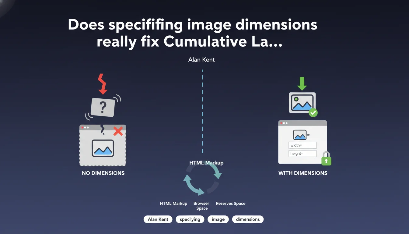
Alan Kent asserts that adding width and height attributes to images in HTML allows browsers to reserve the necessary space before loading, thus preventing layout shifts. This straightforward practice can resolve a significant portion of CLS issues without requiring complex JavaScript interventions. Whether this single action suffices across all contexts remains to be seen.
What you need to understand
How do image dimensions influence CLS?
The Cumulative Layout Shift (CLS) measures visual instability on a page — every time an element moves without user interaction, the score degrades. Images without explicit dimensions pose a classic problem: the browser doesn't know their final size before downloading them.
The result? It first displays an empty or arbitrary space, then reflows the page once the image loads. This abrupt shift penalizes CLS, especially on mobile where bandwidth is unpredictable.
What does "specifying dimensions" actually mean?
It means adding the width and height attributes directly to the <img> tag. These values don't need to be exact pixel measurements — CSS can resize them via max-width: 100% — but they must respect the aspect ratio of the image.
The browser uses this information to calculate the necessary space as soon as it parses the HTML, before even downloading the file. It's a native mechanism, fast, and requires no third-party library.
Is this practice new or just being reminded?
It already existed in early W3C recommendations but was largely abandoned with the rise of responsive design. Many developers removed these attributes out of fear that they would rigidify the layout.
Except modern browsers have evolved: they now understand intrinsic aspect-ratio and adjust reserved space even when CSS resizes the image. Google is simply reviving a forgotten best practice, adapted to Core Web Vitals.
- HTML dimensions allow the browser to pre-allocate space before download
- CSS can still control the final size via
width: 100%andheight: auto - This method works natively without JavaScript or frameworks
- The aspect ratio must be respected to avoid distortion
- Lazy-loaded images also benefit from this treatment
SEO Expert opinion
Is this statement consistent with real-world observations?
Yes, and it's even one of the most effective interventions for quickly fixing CLS. On sites where images lacked dimensions, we regularly observe CLS reductions of 30 to 50% just by adding width and height. No magic, just browser mechanics.
However — and Alan Kent doesn't specify this — this solution only fixes layout shifts caused by images. If your CLS stems from ads injected dynamically, cookie banners without reserved space, or web fonts that reflow text, specifying image dimensions won't change anything. You need to diagnose the real cause before applying the remedy.
In which cases is this technique insufficient?
Images whose ratio changes by viewport — typically via <picture> or srcset with different crops — can be problematic. If the desktop image is 16:9 and the mobile version is 4:3, specifying a single pair of dimensions isn't enough. [To verify]: some modern frameworks handle this via CSS custom properties, but it's not exhaustively documented by Google.
Another tricky case: images loaded via JavaScript after user interaction. If your script inserts an <img> tag without dimensions into the DOM, the browser has no way to anticipate the necessary space. You then need to dimension the parent container in CSS or calculate the ratio before injection.
What's the best method for implementing this at scale?
On a site with a few pages, you can fix things manually. On a site with thousands of URLs and images managed by non-technical editors, you need to automate at the server or templating system level. WordPress has done this natively since version 5.5, but only if the theme doesn't override these attributes.
For custom sites, the ideal approach is to extract EXIF metadata or read dimensions when uploading, then store these values in a database. The template then injects them into the HTML. If you use an image transformation CDN, some like Cloudinary or Imgix can add these attributes automatically via their SDK.
Practical impact and recommendations
What concretely should you do on your site?
First step: audit the HTML of your main pages. Inspect <img> tags and verify if width and height are present. A Chrome DevTools script can list all images without dimensions in seconds.
Next, determine where these tags are generated. WordPress theme? Liquid template on Shopify? React component? Once the source is identified, add the attributes either manually or via a hook or templating helper.
For already-published images, you can retrieve their dimensions via a server script that parses files with a library like ImageMagick or Sharp (Node.js). Store these values in a database or JSON file, then inject them during rendering.
How do you verify that the implementation actually fixes CLS?
Use PageSpeed Insights or Lighthouse in mobile mode to measure CLS before/after. Compare scores across multiple representative pages, not just the homepage. CLS can vary greatly depending on content.
Additionally, open Chrome DevTools, Performance tab, and record page load with 3G throttling. The timeline will visually show you when layout shifts occur. If images no longer appear as a source of shift, you've succeeded.
- Audit
<img>tags to identify those without width/height - Verify that the specified ratio matches the actual image dimensions
- Test responsive behavior: the image shouldn't distort with
width: 100%; height: auto; - Check that lazy-loaded images also retain their dimensions
- Measure CLS before/after with PageSpeed Insights and Chrome DevTools
- Automate dimension extraction at upload time or build time
- Verify that your CMS or framework doesn't strip these attributes during rendering
❓ Frequently Asked Questions
Dois-je spécifier les dimensions en pixels ou en unités relatives ?
Que faire si l'image change de ratio selon le breakpoint (picture avec srcset) ?
Les images SVG doivent-elles aussi avoir des dimensions spécifiées ?
Est-ce que les plugins de lazy-loading respectent ces attributs ?
Faut-il aussi spécifier les dimensions pour les images en background CSS ?
🎥 From the same video 10
Other SEO insights extracted from this same Google Search Central video · published on 06/05/2022
🎥 Watch the full video on YouTube →
💬 Comments (0)
Be the first to comment.