Official statement
Other statements from this video 4 ▾
- □ Is Google Really Changing Its Rules or Just Repackaging Them With Search Essentials?
- □ Should you really start your SEO audit with your browser and Search Console?
- □ Are Google Search Console's bubble charts really revolutionizing your SEO analysis?
- □ Should you really delete problematic elements instead of fixing them for SEO?
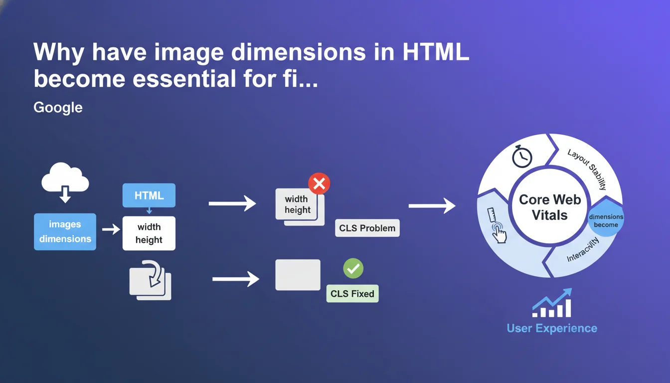
Google confirms that adding width and height attributes directly to image HTML resolves the majority of CLS issues. This simple yet often overlooked practice allows browsers to reserve the necessary space before loading, preventing visual shifts that damage Core Web Vitals. Bottom line: no dimensions = guaranteed poor CLS score.
What you need to understand
What is CLS and why do images cause problems?
The Cumulative Layout Shift measures the visual instability of a page during loading. Images without explicit dimensions are the number one cause of these shifts.
When the browser encounters an <img> tag without width/height attributes, it can't anticipate the space needed. It displays text first, then loads the image which suddenly pushes content down — exactly what CLS penalizes.
How do HTML dimensions solve this problem?
By declaring width="800" height="600", the browser calculates the aspect ratio before even loading the image. It immediately reserves the correct space, even if the image is 2 MB and takes 3 seconds to arrive.
Modern browsers use these dimensions to create a proportional placeholder via CSS. Result: zero shift when the image actually displays.
Does this recommendation apply to all image types?
Technically yes, but the impact varies. Images above the fold (immediately visible) are critical — that's where CLS is determined in the first few seconds.
For lazy-loaded images lower on the page, the urgency is less since the main CLS is already calculated. But maintaining consistency remains a best practice.
- HTML dimensions allow browsers to reserve space before loading
- This practice fixes the majority of CLS issues related to images
- Impact is greatest for images visible immediately (above the fold)
- Modern browsers automatically calculate aspect ratio from width/height
- Even with lazy-loading, dimensions remain necessary to prevent visual jumps
SEO Expert opinion
Is this recommendation actually new?
No, and it's almost embarrassing. Specifying image dimensions in HTML was a standard web 1.0 practice, abandoned during the responsive design era out of fear that width="800" would lock in a fixed size.
Except since 2019, browsers interpret these attributes differently: they calculate an aspect ratio, not an absolute size. CSS takes over with max-width: 100%; height: auto; for responsiveness. Google is just repeating what serious web developers have been doing for 5 years already.
Do all CMS platforms handle these dimensions correctly?
WordPress has automatically added width/height since version 5.5 (2020). Shopify and most modern CMS platforms do the same. But — and this is where it breaks down — custom themes, poorly coded visual builders, and images inserted manually via WYSIWYG editors often forget these attributes.
Worse: some developers intentionally remove them thinking "that's how you do responsive." Result, modern sites with catastrophic CLS scores when the solution requires just two HTML attributes.
Is this practice alone enough for good CLS?
Let's be honest: no. Image dimensions fix the most common problem, but not the only sources of CLS. Dynamic ad banners inserting themselves, web fonts loading late (FOIT/FOUT), social embeds without defined heights — all that degrades CLS too.
Google intentionally simplifies the message to reach the most sites. But a real CLS audit looks far beyond images alone. [To verify]: the actual impact of this single optimization on sites with multiple layout shift sources.
<img> and <picture> tags.Practical impact and recommendations
How do I check if my images have proper dimensions?
Open Chrome Developer Tools (F12), inspect an image, and check whether the width and height attributes are present in the HTML source. Not in CSS — in the HTML markup itself.
For a complete audit, use Screaming Frog in "Images" mode with the "Missing Width/Height Attributes" option. You'll immediately see all non-compliant images. PageSpeed Insights also flags this issue under "Diagnostics" in the "Image elements do not have explicit width and height" section.
What should I do if my CMS doesn't add these dimensions automatically?
First step: check your CMS version and update it. WordPress 5.5+, Shopify, Webflow handle this natively. If you're on a custom CMS or old version, you need to intervene at the template or image management plugin level.
For WordPress, if your theme strips these attributes, add to functions.php:
add_filter('wp_img_tag_add_width_height_attr', '__return_true');For pure HTML/PHP, ensure your image generation functions systematically include these attributes. It's basic code, but many devs overlook it.
What mistakes should I avoid when implementing?
Never use arbitrary or false values just to "check the box." If your image is 1200×800 but you set width="100" height="100", the browser will reserve a square — then the actual image will shift everything anyway when it loads. Dimensions must match the actual proportions of your source file.
Another trap: failing to adapt dimensions for responsive images with srcset. In that case, use the dimensions of the default image (the src), not the variants. The browser will adjust proportionally.
- Audit all images on your site with Screaming Frog or PageSpeed Insights
- Verify your CMS is current and automatically adds width/height
- For WordPress, force activation via the wp_img_tag_add_width_height_attr filter
- Confirm dimensions match the actual proportions of your files
- Don't confuse HTML dimensions with CSS display size — they're two different things
- Test your actual CLS with Chrome User Experience Report or Lighthouse before/after
- Don't forget images in dynamic elements (sliders, modals, AJAX content)
❓ Frequently Asked Questions
Est-ce que l'attribut loading="lazy" empêche le CLS si j'ai mis width et height ?
Les dimensions doivent-elles être en pixels ou peuvent-elles être en pourcentage ?
Que faire pour les images chargées dynamiquement en JavaScript ?
Mon site a un bon CLS sans dimensions d'image, dois-je quand même les ajouter ?
Les images SVG ont-elles aussi besoin de width et height ?
🎥 From the same video 4
Other SEO insights extracted from this same Google Search Central video · published on 16/02/2023
🎥 Watch the full video on YouTube →
💬 Comments (0)
Be the first to comment.