Official statement
Other statements from this video 1 ▾
Google officially recommends using Chrome DevTools in Device mode to preview how web pages appear on mobile devices. The tool allows you to simulate different mobile devices directly from Chrome Desktop, without needing physical equipment. This method has become the standard for checking mobile compatibility before indexation.
What you need to understand
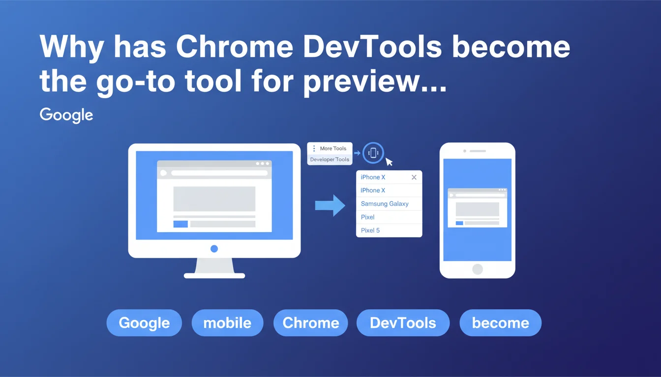
What is the exact method recommended by Google?
Google outlines a precise process: open the three-dot menu in Chrome Desktop, select More Tools, then Developer Tools. The critical step is clicking the Device icon (a phone and tablet symbol) to activate emulation mode.
A dropdown menu then lets you select a specific phone model. Chrome simulates the resolution, display ratio, and viewport of the chosen device. It's a testing environment that reproduces — in theory — the actual behavior of mobile browsers.
Why does Google emphasize this tool over others?
This recommendation is far from arbitrary. Chrome is Google's browser, and its Blink rendering engine is what Googlebot uses to crawl and index pages. Testing with Chrome DevTools gets you as close as possible to what the bot actually sees.
The tool is free, built-in, and requires no third-party installation. Unlike online simulators or extensions, DevTools offers granular control: network throttling, JavaScript disabling, geolocation simulation. It's a complete debugging environment, not just a visual preview.
What pitfalls should you avoid with this method?
- Emulation is not a perfect reproduction of physical hardware — certain CSS or JavaScript bugs may not appear
- DevTools network throttling simulates slow connectivity, but not the real latency variations of mobile networks
- Emulated user-agents can trigger different behaviors than those observed on actual devices
- Core Web Vitals measured in emulation mode don't always reflect real-world performance (CrUX data remains the reference)
- Some frameworks detect emulation and modify their behavior accordingly
SEO Expert opinion
Is this recommendation sufficient to validate mobile rendering?
Let's be honest: Chrome DevTools is an excellent starting point, but not a complete solution. The tool simulates an environment; it doesn't reproduce it. The differences between emulation and real-world data have been documented for years — CSS rendering bugs specific to certain models, divergent JavaScript behaviors, approximate touch event handling.
Google nowhere mentions the need to cross-reference this verification with testing on actual devices. That's a gap. Experienced professionals know that a clean DevTools test guarantees nothing on an iPhone 12 Mini or Samsung Galaxy A53 in real-world conditions. [To verify]: Google implicitly claims that emulation is sufficient, but no data supports this position.
What technical limitations does Google not mention?
First point: DevTools emulates the viewport, not the mobile browser. Chrome Desktop with a 375px viewport is not Safari iOS. Rendering engines differ (Blink vs WebKit), as do JavaScript optimizations. A site that works perfectly in emulation can crash on Safari mobile due to an ES6 incompatibility or missing polyfill.
Second point: the tool doesn't simulate real hardware constraints. An entry-level phone with 2GB of RAM and a limited processor will have radically different performance than Chrome Desktop emulated on a powerful development machine. Smooth animations locally become janky on a budget device — and DevTools doesn't show that.
When is this method truly reliable?
DevTools excels at verifying responsive structure: CSS breakpoints, adaptive grids, media query behavior. It's a quick visual debugging tool for identifying a header that overflows, a button that's too small, text that's hard to read. For this specific use case, it's perfect.
The tool is also reliable for analyzing mobile DOM: verifying that main content isn't hidden in an accordion, that interactive elements remain accessible, that lazy-loaded images load correctly. But the moment you talk about real-world performance, cross-browser compatibility, or complex JavaScript behaviors, DevTools shows its limits.
Practical impact and recommendations
What should you concretely integrate into your testing workflow?
Use DevTools as the first validation step, not your only checkpoint. Configure emulations for the most common resolutions in your Analytics: iPhone SE (375x667), iPhone 12 Pro (390x844), Samsung Galaxy S20 (360x800). Test each major template on your site — homepage, product page, blog article, conversion page.
Enable network throttling (Fast 3G minimum) to simulate realistic mobile conditions. Verify that your responsive images load correctly, that your web fonts don't block rendering, that your critical JavaScript executes without noticeable delay. Use the Coverage tab to identify unused CSS and JS that's hurting your mobile performance.
What critical errors should you avoid with this tool?
- Never rely on testing a single emulated device profile — test at least 3 different resolutions (small, medium, large screens)
- Don't forget to test in landscape mode — some sites break completely in horizontal orientation
- Avoid validating only in fast 4G — Fast 3G throttling reveals loading issues invisible under optimal conditions
- Don't ignore warnings in the DevTools console — JavaScript that fails silently can block critical features
- Never assume that a clean DevTools test eliminates the need for Safari iOS testing — it's a unique browser with its own bugs
How can you expand this approach for solid validation?
Cross-reference your DevTools tests with complementary tools. Google Search Console (mobile usability test) shows you what Googlebot actually sees. PageSpeed Insights provides CrUX metrics from real users on real devices. BrowserStack or LambdaTest let you test on real mobile browsers without physical equipment.
Ideally, assemble a panel of 2-3 physical devices representative of your audience: a recent iPhone (Safari iOS), a mid-range Android (Chrome), a low-cost device (to test degraded performance). These real-world tests catch issues DevTools can't anticipate — touch bugs, contrast problems in sunlight, real network latency.
❓ Frequently Asked Questions
Chrome DevTools remplace-t-il complètement les tests sur appareils physiques ?
Quel throttling réseau utiliser pour des conditions mobiles réalistes ?
Les Core Web Vitals mesurées en émulation sont-elles fiables ?
Faut-il tester en mode paysage (landscape) ?
Quels modèles d'appareils prioriser dans DevTools ?
🎥 From the same video 1
Other SEO insights extracted from this same Google Search Central video · published on 26/09/2022
🎥 Watch the full video on YouTube →
💬 Comments (0)
Be the first to comment.