Official statement
Other statements from this video 1 ▾
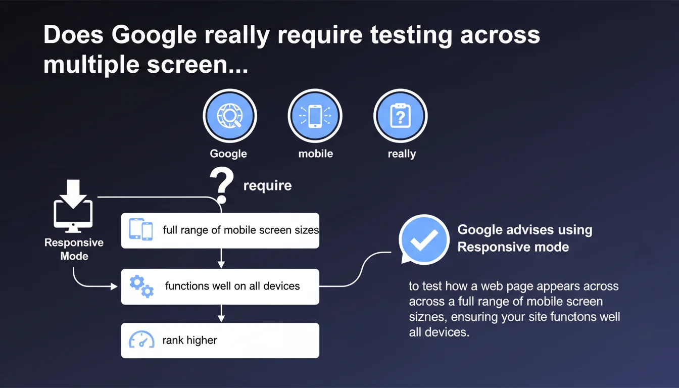
Google explicitly recommends using the Responsive mode in Chrome DevTools to test how your website displays across multiple mobile screen sizes. The goal is to ensure your site works correctly on all devices, not just one or two standard formats. This approach goes beyond the basic 'mobile-friendly' test.
What you need to understand
How does this recommendation differ from a simple mobile-friendly test?
Google's mobile-friendly test checks that a page meets basic criteria: readable text without zoom, no Flash, sufficient touch spacing. It's a binary check, often limited to a standard resolution (375x667 px for example).
The current recommendation goes further. Google encourages testing across a complete range of sizes — from small smartphones (320px wide) to phablets (428px and beyond). DevTools' Responsive mode allows you to dynamically adjust the viewport to detect display bugs, overflowing text, inaccessible buttons, or poorly resized images.
Why does Google emphasize the diversity of mobile formats?
Mobile device fragmentation is massive. Between an iPhone SE, a Pixel 7 Pro, and a Galaxy Z Fold, resolutions and aspect ratios vary enormously. A site that displays correctly on an iPhone 12 (390px) can be broken on narrower or wider devices.
Google crawls and indexes in mobile-first mode. If your content is unreadable or truncated on certain resolutions, this degrades user experience — and potentially your Core Web Vitals signals (notably CLS). An invisible CTA button on small screens means higher bounce rate and lower conversion rate.
Is DevTools' Responsive mode sufficient as the only testing tool?
It's a good starting point, but not an absolute guarantee. DevTools simulate dimensions, but not always the specifics of native rendering (system fonts, touch handling, iOS-specific WebKit bugs). Testing on real devices remains the gold standard for final validation.
That said, for quick iterative audits, Responsive mode is essential. It allows you to catch 90% of layout problems before even pulling out a phone.
- Google recommends testing across a complete range of mobile screen sizes, not just one standard resolution
- Chrome DevTools' Responsive mode is the preferred tool for this iterative verification
- This approach aims to guarantee maximum compatibility against mobile device fragmentation
- Poor display on certain formats can impact UX signals and conversions
SEO Expert opinion
Is this statement consistent with field practices?
Absolutely. We regularly see sites that pass Google's mobile-friendly test but completely break on 320px screens or beyond 414px. Developers often test on their own smartphone — a classic bias.
During audits, we systematically spot layout bugs on "edge case" resolutions: buttons outside viewport, sliders that don't scroll, inaccessible hamburger menus. These anomalies go unnoticed until you methodically test multiple formats. Google is pointing out a frequent blind spot here.
What nuances should be added to this recommendation?
First nuance: DevTools' Responsive mode does not replace real device testing. Some rendering errors (particularly iOS Safari) are only detectable in real conditions. DevTools simulate well, but not perfectly.
Second nuance: Google provides no exhaustive list of priority resolutions. [To verify] which formats Google precisely crawls in mobile-first mode. You can start from your site's GA4 stats to identify the most frequent resolutions, but the lack of clear directive leaves a gray area.
Third point — and this is rarely stated: some responsive bugs don't necessarily impact ranking if main content remains accessible. A misaligned secondary button is annoying for UX, but if Googlebot can crawl links and read text, the direct SEO impact may be limited. However, high CLS or invisible text will penalize you.
In what cases does this rule not fully apply?
If your site targets exclusively desktop (very niche B2B, intranet, complex SaaS), mobile-first indexing still applies, but tactical urgency is lower. That said, even in B2B, 30 to 40% of traffic often comes from mobile — ignoring this recommendation would be a mistake.
Practical impact and recommendations
What should you concretely do to test effectively?
Open Chrome DevTools (F12), enable Responsive mode (Ctrl+Shift+M on Windows, Cmd+Shift+M on Mac). Start by testing critical resolutions: 320px, 375px, 390px, 414px, 428px width. Check display in both portrait and landscape.
Browse key pages: homepage, category pages, product sheets, blog articles, contact forms. Spot text overflow, buttons outside click zone, images not resizing, broken menus. Log each anomaly in a spreadsheet.
Supplement with real tests on at least 3 physical devices (ideally iOS and Android, small and large format). DevTools don't catch everything — some CSS or JavaScript bugs only appear in native conditions.
What errors should you avoid when implementing responsive design?
Don't define overly rigid media queries (e.g., only for 375px and 768px). Favor a fluid approach with breakpoints tailored to content, not specific devices. A well-designed site adapts smoothly across a spectrum, not in fixed jumps.
Avoid fixed pixel font sizes. Use rem or em to ensure proportional scaling. Test text readability without zoom: if users must pinch to read, you've failed.
Don't neglect touch zones. Google recommends a minimum 48px spacing between clickable elements. On small screens, buttons too close together cause accidental clicks and degrade UX — potentially impacting behavioral signals.
How do you verify your site complies with this recommendation?
Run an audit with Lighthouse (built into Chrome DevTools) in mobile mode. Check Accessibility and Best Practices scores — some responsive issues are flagged there (text too small, elements outside viewport).
Use Google's Mobile-Friendly Test as a baseline, but don't stop there. Cross-check with BrowserStack or LambdaTest to simulate real devices if you don't have physical device access.
Monitor your Core Web Vitals via Search Console, segmented by device. High CLS only on mobile may signal a responsive issue (images without dimensions, content shifting on load).
- Test critical resolutions (320px, 375px, 390px, 414px, 428px) in Responsive mode
- Verify display in both portrait AND landscape
- Browse key pages: homepage, categories, product sheets, forms
- Supplement with real tests on at least 3 physical devices (iOS/Android, small/large format)
- Use Lighthouse and Mobile-Friendly Test as baseline, then advanced simulation tools
- Monitor Core Web Vitals segmented by device in Search Console
- Fix any overflow, inaccessible button, text unreadable without zoom
❓ Frequently Asked Questions
Le test Mobile-Friendly de Google suffit-il à valider la compatibilité multi-écrans ?
Quelles résolutions mobiles dois-je absolument tester ?
Les DevTools Chrome simulent-ils fidèlement le rendu sur iOS Safari ?
Un bug de responsive uniquement visible sur petits écrans peut-il impacter mon ranking ?
Faut-il vraiment tester en mode paysage sur mobile ?
🎥 From the same video 1
Other SEO insights extracted from this same Google Search Central video · published on 26/09/2022
🎥 Watch the full video on YouTube →
💬 Comments (0)
Be the first to comment.