Official statement
Other statements from this video 25 ▾
- □ Les liens JavaScript retardent-ils vraiment la découverte par Google ?
- □ Pourquoi Google ignore-t-il vos balises canoniques quand le HTML brut contredit le rendu ?
- □ Le noindex en HTML brut empêche-t-il définitivement le rendu JavaScript par Google ?
- □ JavaScript et SEO : peut-on vraiment modifier title, meta et liens côté client sans risque ?
- □ Le JavaScript côté client est-il vraiment un frein pour vos performances SEO ?
- □ HTML brut vs rendu : Google s'en fiche-t-il vraiment ?
- □ Google AdSense pénalise-t-il vraiment la vitesse de votre site comme n'importe quel script tiers ?
- □ Faut-il s'inquiéter des erreurs 'other error' sur les images dans la Search Console ?
- □ Les liens de navigation JavaScript affectent-ils vraiment le référencement de votre site ?
- □ Peut-on vraiment perdre le contrôle de sa canonical en laissant l'attribut href vide au chargement ?
- □ Quel crawler Google utilise vraiment ses outils de test SEO ?
- □ Les données structurées de votre version mobile s'appliquent-elles aussi au desktop ?
- □ Faut-il vraiment arrêter de craindre le JavaScript pour le SEO ?
- □ Les liens JavaScript retardent-ils vraiment la découverte par Google ?
- □ Pourquoi une balise canonical différente entre HTML brut et rendu peut-elle ruiner votre stratégie de canonicalisation ?
- □ Peut-on vraiment retirer un noindex via JavaScript sans risquer la désindexation ?
- □ Peut-on vraiment modifier les balises meta et les liens en JavaScript sans risque SEO ?
- □ Les produits Google bénéficient-ils d'un avantage SEO caché dans les résultats de recherche ?
- □ Faut-il s'inquiéter des erreurs 'other' dans l'outil d'inspection d'URL ?
- □ Google ignore-t-il vraiment vos images lors du rendu pour la recherche web ?
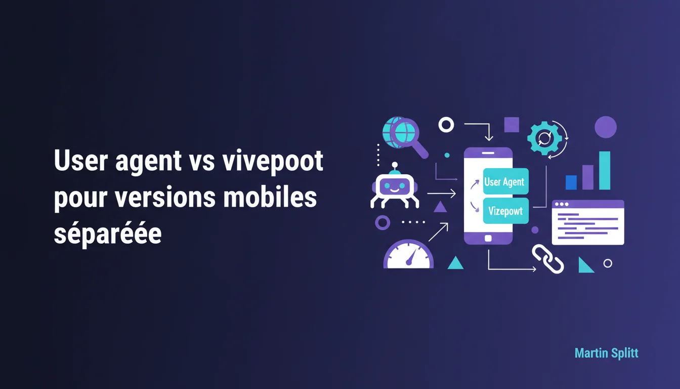
- □ User agent ou viewport : Google fait-il vraiment la différence pour l'indexation mobile ?
- □ Les liens générés en JavaScript transmettent-ils vraiment les signaux de ranking comme les liens HTML classiques ?
- □ Une balise canonical vide en HTML peut-elle forcer Google à auto-canonicaliser votre page par erreur ?
- □ Le Mobile-Friendly Test peut-il remplacer l'URL Inspection Tool pour auditer le crawl mobile ?
- □ Pourquoi Google ignore-t-il vos données structurées desktop après le mobile-first indexing ?
Google states that the user agent is sufficient for serving separate mobile and desktop versions, yet still recommends viewport detection for an enhanced overall user experience. This nuance highlights a gap between what works for Googlebot and what truly optimizes UX. In practice, if you are still maintaining separate URLs like m.site.com, the user agent remains technically valid for SEO — but switching to responsive design or viewport detection ensures less user friction.
What you need to understand
What is the reason behind Google's distinction between user agent and viewport?<\/h3>
Detection via user agent<\/strong> relies on analyzing the string sent by the browser or bot during the HTTP request. It is a server-side method: the site identifies the device (mobile, desktop, bot) before even sending the HTML. Google accepts this without issue for serving separate versions — typically m.site.com<\/strong> versus www.site.com.<\/p> On the other hand, detection by viewport<\/strong> is based on the actual dimensions of the screen through CSS and JavaScript. The server sends the same HTML, but the display adapts dynamically. This is the logic of responsive design. Google prefers this approach because it better covers edge cases: tablets, foldables, resized windows, modified or spoofed user agents.<\/p> No. Martin Splitt clearly states: the user agent is sufficient for Google<\/strong>. If your legacy infrastructure relies on separate mobile URLs detected by user agent, you are not penalized. Googlebot mobile identifies correctly, the server redirects or serves the right version, and everything works.<\/p> The issue is not strictly SEO; it is UX. A user switching devices, moving from portrait to landscape, or using a browser with an atypical user agent risks landing on the wrong version. The viewport, on the other hand, adjusts in real-time. This is why Google promotes this method “in general”<\/strong> — not for its algorithm, but for your users.<\/p> It mainly concerns legacy sites that still maintain separate mobile versions<\/strong> rather than a unified responsive design. These architectures still exist — major media outlets, legacy e-commerce, complex platforms where a complete redesign is not budgeted.<\/p> If you are in this situation, Google reassures you: continuing with the user agent will not break your mobile-first indexing. But it also reminds you that it is a compromise solution, not the optimum. The real target remains responsive or adaptive designs based on viewport.<\/p>Does this mean that the user agent is obsolete for SEO?<\/h3>
In what context does this statement remain relevant today?<\/h3>
SEO Expert opinion
Is this statement consistent with on-the-ground practices?<\/h3>
Yes, absolutely. We still see legacy news or e-commerce sites serving m.domain.com via user agent, and they rank without issues. Googlebot mobile<\/strong> identifies correctly, the server makes a 302 redirect or serves the right version directly, with no indexing issues observed.<\/p> What Martin Splitt does not explicitly state is that configuration errors<\/strong> remain frequent. Variants include forgetting the cross alternate/canonical tags, using a 301 redirect instead of a 302, or user agent detection that misses modern bots or tablets. In these cases, the viewport would have bypassed the problem — a single HTML, one set of canonicals.<\/p> Google says “in general,” and that’s where it gets tricky. There are contexts where serving radically different HTML<\/strong> between mobile and desktop remains relevant — for instance, a mobile app that displays less content for performance reasons or specific touch usage.<\/p> In those cases, server-side user agent detection allows for precise control. The viewport assumes that the same DOM is visually adapted. If your mobile loads 50% fewer features, the viewport is not enough — the device must be accurately detected before sending the HTML. [To be verified]<\/strong>: Google has never detailed if a significant content delta between versions is accepted in mobile-first.<\/p> If you are using a unified responsive design<\/strong> (one URL, one HTML, CSS adaptation), the user agent vs viewport question does not even arise — you are already on the path recommended by Google for years.<\/p> If you are serving dynamic server-side content<\/strong> (SSR with Next.js, Nuxt, etc.) and detecting viewport via CSS media queries, likewise: you are in the optimal case. Splitt's statement targets historical separate architectures<\/strong>, not modern stacks that are already responsive by default.<\/p>What nuances should be added to this recommendation?<\/h3>
In what cases does this rule not apply?<\/h3>
rel="alternate"<\/code> and rel="canonical"<\/code> tags are strictly symmetrical and tested. A configuration error here carries more weight than the user agent vs viewport choice.<\/div>
Practical impact and recommendations
What practical steps should you take if you are still using the user agent?<\/h3>
First, ensure that your detection works for Googlebot mobile<\/strong> (user agent containing “Mobile”, “Android”, “iPhone”). Test with the URL Inspection tool in Search Console — mobile mode. If the correct version displays, you are covered for strict SEO.<\/p> Next, test with real devices<\/strong>: tablets, foldables, less common browsers. If some end up on the desktop version when they should see the mobile one, that’s where the viewport would have avoided the pitfall. In this case, assess the cost of migrating to a unified responsive design versus the current UX risk.<\/p> Never make a permanent 301 redirect<\/strong> between desktop and mobile. Use a 302 (or 307 if you want to be picky about HTTP method). Google must understand that both versions exist in parallel, not that one replaces the other.<\/p> Another classic trap: forgetting the cross rel="alternate" and rel="canonical"<\/strong> tags. The desktop page must point to the mobile one with Analyze your mobile bounce rates<\/strong> and user journeys. If you notice users manually switching to the desktop version (link at the bottom of the page “View full site”), it’s a signal that the user agent detection is missing its target.<\/p> Also, look at your server logs<\/strong>: how many requests with a mobile user agent still end up on the desktop version (or vice versa)? If the volume is marginal, sticking with the user agent remains defensible. If it represents 5-10% of traffic, migration becomes worthwhile.<\/p>What errors should you avoid with separate mobile versions?<\/h3>
<link rel="alternate" media="only screen and (max-width: 640px)" href="https:\/\/m.site.com\/page"><\/code>, and the mobile must canonicalize back to the desktop with <link rel="canonical" href="https:\/\/www.site.com\/page"><\/code>. Without this, Google may duplicate indexing or choose the wrong version.<\/p>How can you tell if a migration to viewport is necessary?<\/h3>
rel="alternate"<\/code> and rel="canonical"<\/code> tags on all page pairs.<\/li>
❓ Frequently Asked Questions
Est-ce que Google pénalise les sites qui utilisent encore le user agent pour servir des versions mobiles séparées ?
Quelle différence entre détection user agent et détection viewport en termes de SEO pur ?
Dois-je migrer vers un design responsive si j'ai déjà des URLs mobiles séparées qui fonctionnent ?
Quels sont les risques concrets de mal configurer des versions mobiles séparées ?
Le viewport est-il toujours la meilleure solution, même pour des sites complexes ?
🎥 From the same video 25
Other SEO insights extracted from this same Google Search Central video · published on 26/04/2021
🎥 Watch the full video on YouTube →Related statements
Get real-time analysis of the latest Google SEO declarations
Be the first to know every time a new official Google statement drops — with full expert analysis.
💬 Comments (0)
Be the first to comment.