Official statement
Other statements from this video 2 ▾
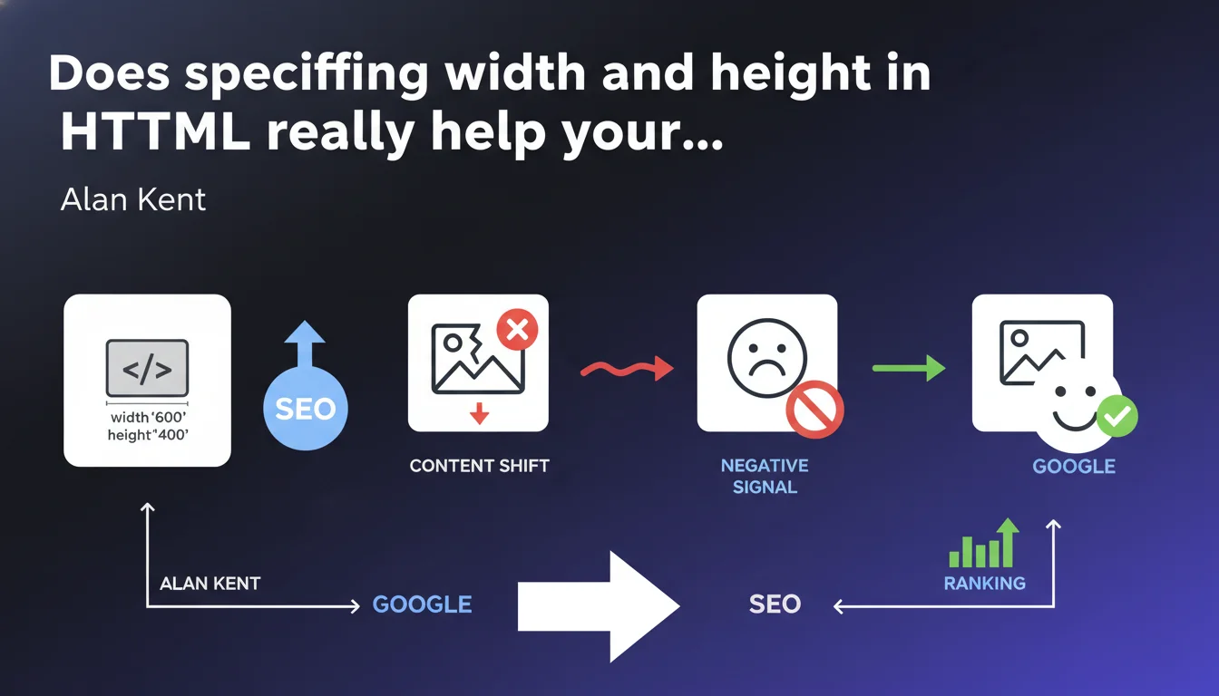
Google confirms that missing width and height attributes on images generate a negative SEO signal, primarily due to content shifts (CLS). Specifying these dimensions directly in HTML is not just a technical best practice — it's a ranking factor through Core Web Vitals.
What you need to understand
Why do width and height attributes impact SEO?
The answer comes down to three letters: CLS (Cumulative Layout Shift). When the browser loads a page without knowing the dimensions of images, it cannot reserve the necessary space. Result: content shifts abruptly when the image appears.
This phenomenon frustrates users, but more importantly — and this is what matters for us — it's part of the Core Web Vitals. Google measures these shifts and has integrated them into its ranking algorithm for several years. Alan Kent says it plainly: failing to specify these attributes generates a negative signal.
What's the difference between CSS and HTML attributes?
Many developers define image dimensions only in CSS. The problem? The browser must first download and parse the CSS before knowing these dimensions. During this delay — even if brief — the space isn't reserved.
With width and height attributes directly in the HTML, the browser instantly knows the dimensions, before even loading the CSS or the image. It can therefore reserve the correct space from the first render. It's this anticipation that prevents the shift.
Are all types of images affected?
Yes, without exception. Whether content images, product visuals, banners, or even logos — every <img> tag should have width and height attributes. Background CSS images are not subject to this specific recommendation.
- The width and height attributes directly reduce CLS, one of the three Core Web Vitals
- These attributes must be placed in the HTML, not just in CSS
- The browser can reserve space before the image loads
- This practice applies to all img tags on the site
- The absence of these attributes constitutes a negative signal for Google
SEO Expert opinion
Does this statement really change anything?
Let's be honest: this recommendation isn't new. HTML specs have existed for decades, and web performance best practices have hammered this point since Core Web Vitals arrived. What changes is the explicit confirmation that this is a negative SEO signal.
In the field, we observe a clear correlation between well-ranked sites and low CLS scores. But be careful — correlation is not causation. CLS is just one factor among hundreds. A site with perfect CLS but mediocre content will never outrank a relevant competitor.
How much impact should you expect?
That's where it gets tricky. Google never quantifies the relative weight of its ranking factors. Alan Kent speaks of a "negative signal," but without specifying its intensity. [To verify]: Are we talking about a micro-penalty or a real competitive disadvantage?
A/B tests conducted on e-commerce sites generally show modest gains — rarely more than a few positions on already well-worked queries. Impact is more visible on technically neglected sites where CLS explodes. But if your direct competitors have already optimized this point, fixing it simply brings you to parity.
In which cases does this rule create problems?
Dynamically loaded images via JavaScript raise questions. If you use a custom lazy loading system or a framework that injects images on the client side, specifying width and height becomes more complex — but remains possible with the right techniques.
Images whose proportions vary by context (art direction, contextual cropping) also require a more sophisticated approach, often via <picture> and srcset. In these cases, each source must have its own dimensions specified.
Practical impact and recommendations
What should you do concretely on an existing site?
First step: audit your CLS via Google Search Console, "Core Web Vitals" section. If you're in the red or orange, images without dimensions are probably the culprit. PageSpeed Insights details exactly which images are causing layout shift.
Next comes the technical work. On a static site or standard CMS, adding width and height is generally simple — it's mainly tedious if you have thousands of images. On WordPress, plugins like Perfmatters or WP Rocket can automate this for new images.
For sites with dynamically generated content, your backend needs to calculate and inject these attributes when generating HTML. This often means storing image metadata in a database or calculating it on the fly — an operation that can slow the server if poorly optimized.
What errors should you avoid during implementation?
Classic mistake: putting made-up dimensions just to satisfy the audit tool. If you specify width="500" height="300" when the image is actually 1200×800, the browser will need to recalculate — and potentially create layout shift anyway.
Another pitfall: forgetting images with lazy loading. Even an image that loads late should have its dimensions specified, otherwise it will cause a shift when it appears in the viewport.
- Audit current CLS via Search Console and PageSpeed Insights
- Identify all
<img>tags without width/height attributes - Get the actual dimensions of each image (not CSS display dimensions)
- Implement an automated solution for new uploads
- Verify that responsive design still works correctly
- Test on both mobile and desktop after deployment
- Re-measure CLS after a few days to validate improvement
How do you measure real impact after correction?
Google Search Console updates its Core Web Vitals data with a 28-day delay. Don't expect to see changes immediately. Use real-time tools (Chrome DevTools, WebPageTest) to technically validate that CLS has decreased.
For rankings, track your positions on strategic queries before and after optimization. But isolating the specific impact of this change will be difficult — too many variables shift simultaneously. The key is confirming you haven't broken anything and that the overall trend remains positive.
❓ Frequently Asked Questions
Les attributs width et height ralentissent-ils le chargement de la page ?
Faut-il modifier les dimensions si l'image est redimensionnée en CSS ?
Cette optimisation fonctionne-t-elle pour les images en lazy loading ?
Que faire pour les images dont les proportions changent selon le device ?
Un site peut-il ranker sans ces attributs s'il a un excellent contenu ?
🎥 From the same video 2
Other SEO insights extracted from this same Google Search Central video · published on 22/06/2022
🎥 Watch the full video on YouTube →
💬 Comments (0)
Be the first to comment.