Official statement
What you need to understand
What exactly is a dedicated mobile site and how does it work technically?
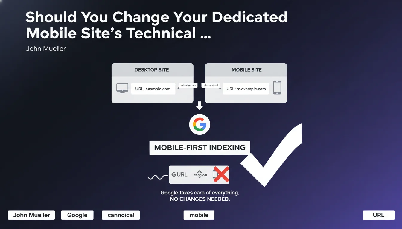
A dedicated mobile site uses two distinct URLs: one for the desktop version and another for the mobile version. For example, www.example.com for desktop and m.example.com for mobile.
This architecture requires specific tags to indicate to Google the relationship between the two versions. The rel="alternate" tag on the desktop page points to the mobile version, while the rel="canonical" tag on the mobile page points to the desktop version.
What does Mobile-First Indexing actually mean for these configurations?
With Mobile-First Indexing, Google primarily uses the mobile version of a site for indexing and ranking. This is a major shift from the old system that favored the desktop version.
Despite this change, the technical configuration of dedicated mobile sites remains unchanged. Google has adapted its algorithms to handle this transition without requiring any modifications on your end.
Why is this clarification from Google so important?
Many SEO practitioners were wondering whether they should reverse the tags: put the canonical from desktop to mobile, or change the direction of rel="alternate". Google's answer is clear: no, don't change anything.
- The rel="alternate" tag stays on the desktop page and points to mobile
- The rel="canonical" tag stays on the mobile page and points to desktop
- Google automatically handles the indexing priority toward the mobile version
- No technical modifications are required when transitioning to Mobile-First Indexing
- This configuration was designed to minimize interventions from webmasters
SEO Expert opinion
Does this statement align with what we're actually seeing in practice?
Absolutely. In my practice, I've observed numerous dedicated mobile sites that continued to perform after transitioning to Mobile-First Indexing without any technical modifications. Google has indeed kept its promise of backward compatibility.
However, it's crucial to emphasize that this technical stability doesn't exempt you from a quality check. Content, structured data, and SEO elements must be equivalent between the two versions to avoid any loss of visibility.
What nuances should we add to this recommendation?
While the technical configuration remains stable, content equivalence between desktop and mobile versions becomes critical. Many dedicated mobile sites have historically offered lighter content on mobile, which poses problems with Mobile-First Indexing.
Google now primarily indexes what you show on mobile. If your mobile version is content-poor, lacking in internal links, or missing structured data, your overall SEO will suffer.
In what situations can this configuration become problematic?
The main risk concerns sites that have neglected their mobile version in terms of content richness. If your m.example.com displays 50% of the content of your www.example.com, you have a major problem.
Another problematic case: implementation errors with rel="alternate" and rel="canonical" tags. If these tags are misconfigured or point to incorrect URLs, Google may struggle to establish the correspondence between your versions, which negatively impacts indexing.
Practical impact and recommendations
What should you actually verify on your dedicated mobile site?
The first step is to audit content parity between your versions. Compare page by page: text, images, videos, internal links, and structured data must be equivalent.
Next, imperatively verify the technical implementation of your tags. Use tools like Screaming Frog or Search Console to identify inconsistencies or tagging errors.
What critical mistakes should you absolutely avoid?
The most common mistake is maintaining impoverished mobile content thinking that technical tags are sufficient. With Mobile-First Indexing, it's your mobile version that determines your overall SEO.
Another trap: modifying tags out of confusion by reversing rel="alternate" and rel="canonical". This modification would break the established logic and create indexing problems. Follow Google's recommendation: don't touch anything on this front.
How can you ensure your configuration is optimal?
- Verify that each desktop page has a rel="alternate" media="only screen and (max-width: 640px)" tag pointing to the corresponding mobile version
- Confirm that each mobile page includes a rel="canonical" tag pointing to the equivalent desktop version
- Audit content parity between the two versions: text, media, links, structured data
- Test your mobile version's loading speed with PageSpeed Insights and fix identified issues
- Verify in Search Console that your site has transitioned to Mobile-First Indexing and review error reports
- Monitor your Core Web Vitals specifically on mobile, as they directly impact your SEO
- Ensure that robots.txt files and metadata are correctly configured for the mobile version
The technical configuration of a dedicated mobile site should not change when transitioning to Mobile-First Indexing. Keep your rel="alternate" and rel="canonical" tags in their current orientation.
The effort should focus on content equivalence between your desktop and mobile versions. This is where your SEO truly plays out, since Google now primarily indexes your mobile version.
These optimizations require deep technical expertise and continuous performance monitoring. The complexity of these audits, particularly for large sites with dedicated mobile architectures, can justify support from a specialized SEO agency capable of precisely diagnosing parity gaps and implementing a customized action plan tailored to your business objectives.
💬 Comments (0)
Be the first to comment.