Official statement
What you need to understand
With Mobile First indexing, Google now uses the mobile version of your site as the primary reference for indexing and ranking. This evolution has raised many questions about acceptable differences between mobile and desktop versions.
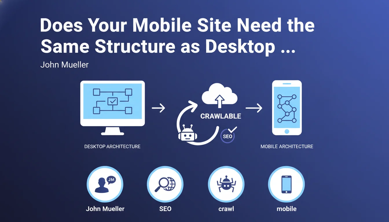
John Mueller's statement provides an important clarification: the navigation architecture can differ between mobile and desktop, unlike content which must remain identical. This flexibility allows you to adapt the user experience to the specificities of each device.
The non-negotiable condition remains crawlability: Google's robots must be able to explore the entire mobile structure without obstacles. Different navigation must never block access to content.
- Mobile architecture can be different from the desktop version
- The content itself must remain identical on both versions
- The mobile structure must be fully crawlable by Googlebot
- Responsive sites are not affected (single structure by definition)
- This flexibility mainly concerns sites with separate mobile versions (m.)
SEO Expert opinion
This position from Google is consistent with real-world practice. Sites with high mobile traffic often use simplified navigation on mobile: condensed menus, differently grouped categories, filters adapted to touch screens. This is a legitimate UX optimization practice.
The essential nuance concerns the distinction between structure and content. You can present your pages differently in menus, reorganize your navigation, but each page must remain accessible and contain the same main content. A product present on desktop must be accessible on mobile, even via a different path.
The real challenge remains the complete crawlability of the mobile version. A different architecture must never become an excuse to hide content or create orphan pages inaccessible to robots.
Practical impact and recommendations
- Audit your mobile structure: verify that all important pages are accessible via standard HTML links, not only through JavaScript
- Test mobile crawling with Google Search Console: use the URL inspection tool to verify that Googlebot accesses your pages properly via mobile navigation
- Avoid overly complex hamburger menus: if your mobile navigation hides too many levels, create a complementary crawlable HTML sitemap
- Maintain content parity: even if the architecture differs, each mobile page must contain the same textual content, images and videos as the desktop version
- Document your differences: if you opt for different structures, map the correspondences between desktop and mobile URLs
- Favor responsive design for new projects: this naturally eliminates this issue and simplifies maintenance
- Monitor orphan pages: use crawling tools (Screaming Frog, Oncrawl) to identify desktop pages that would no longer be linked in the mobile version
These structural optimizations require precise technical expertise, particularly for sites with separate mobile versions or complex architectures. Crawlability analysis, navigation restructuring, and continuous monitoring of content parity often require specialized support. Working with an experienced SEO agency can provide you with an in-depth audit and a custom mobile optimization strategy, adapted to your technical and business constraints.
💬 Comments (0)
Be the first to comment.