Official statement
What you need to understand
What exactly is the fold line and why does Google care about it?
The fold line (or "above the fold") refers to the visible part of a web page without needing to scroll. This concept comes from print media where folded newspapers only showed their upper portion.
Google pays attention to this area because it represents the user's first contact with your content. It's where the visitor decides within a few seconds whether the page answers their search intent or not.
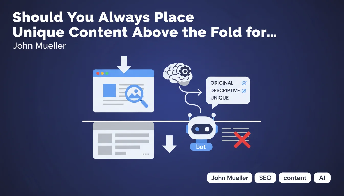
What type of content should appear above the fold line?
According to this statement, immediately visible content must be unique, descriptive and original. It's not simply about displaying text, but content that provides real informational value.
Ideally, the main title (H1) and the lead paragraph (introduction) should be immediately visible. These elements allow both robots and users to quickly understand the topic being addressed.
Why should you avoid images and ads at the top of the page?
Non-textual elements such as large decorative images, advertising banners or sliders occupy precious space without providing semantic context to Google's bot.
These elements push significant textual content downward, forcing the user to scroll to access information. This can harm the user experience and search engines' understanding of the topic.
- The fold line corresponds to the visible area without scrolling
- Google values unique and descriptive textual content in this area
- The title and lead paragraph must be immediately visible
- Decorative images and ads at the top push useful content down
- This area influences Google's understanding of the page
SEO Expert opinion
Is this recommendation still current with the evolution of Google's algorithms?
This statement remains fundamentally valid, but it must be nuanced in the era of Mobile-First Indexing and Core Web Vitals. Google now primarily analyzes the mobile version of sites, where the notion of the fold line varies according to screen sizes.
Google's algorithm has become more sophisticated in its ability to understand the complete structure of a page. The bot no longer limits itself to the immediately visible part, but it still gives significant weight to the first textual elements encountered.
What nuances should be brought to this advice?
You shouldn't go to the extreme by removing all visual dimension. A relevant and optimized image at the top of the page can improve user engagement, especially if it's accompanied by descriptive alt tags and structured data.
The key lies in balance. An intrusive 600px tall advertising banner is problematic, but a 250px illustrative image immediately followed by the H1 and lead paragraph remains acceptable.
In which cases is this rule less critical?
For certain types of sites, such as e-commerce sites or creative portfolios, the visual aspect naturally takes priority. Product images or portfolio pieces must be highlighted, even if this pushes descriptive text down.
Similarly, for transactional pages or conversion landing pages, visual architecture and CTAs can legitimately occupy an important place above the fold line. The important thing is that unique textual content is present and accessible, even if it starts slightly lower down.
Practical impact and recommendations
How can you verify the compliance of your current pages?
Use the URL Inspection tool in Google Search Console to see how Googlebot renders your page. You can also test different screen resolutions with your browser's developer tools (F12).
Measure the height of elements before your main content. On desktop, aim for H1 appearance within the first 600-800 pixels. On mobile, this threshold drops to a maximum of 400-500 pixels.
What concrete actions should you implement?
Reorganize your header to make it as compact as possible. Reduce the height of your logo, simplify your main navigation menu, or make it sticky to gain vertical space.
If you use images at the top of the page, limit their height and ensure they use lazy loading so as not to slow down the display of textual content. Favor optimized formats like WebP.
For advertising, avoid overly imposing formats at the top of the page. Respect the recommendations of the Better Ads Standards which penalize intrusive interstitials and ads that push content down.
What common mistakes should you absolutely avoid?
Never place a full-screen slider that occupies the entire screen height without showing that there's content below. These elements have a very low engagement rate and completely hide your textual content.
Avoid pop-ups or interstitials that display immediately upon arriving on the page, especially on mobile. Google has explicitly penalized these practices since the 2017 intrusive interstitials update.
Don't fall into the trap of "design above all" to the detriment of content. A visually magnificent site where textual content only appears after 1000px of scrolling will be penalized in terms of natural search engine optimization.
- Audit the position of the H1 and lead paragraph on all your main templates
- Reduce header height to a maximum of 100-150px
- Limit decorative images at the top to 200-300px in height
- Eliminate or drastically reduce advertising banners above the fold line
- Test rendering on different screen sizes (mobile, tablet, desktop)
- Check with Search Console how Google renders your pages
- Ensure the title and introduction are visible without scrolling on mobile
- Optimize image weight and loading with lazy loading and modern formats
💬 Comments (0)
Be the first to comment.